Art Direction, Brand Identity, Packaging Design
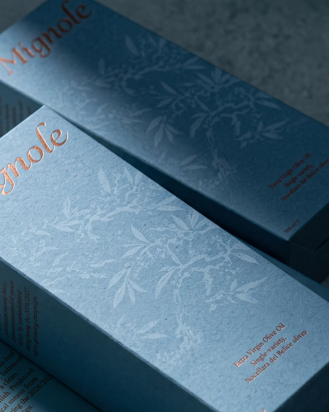
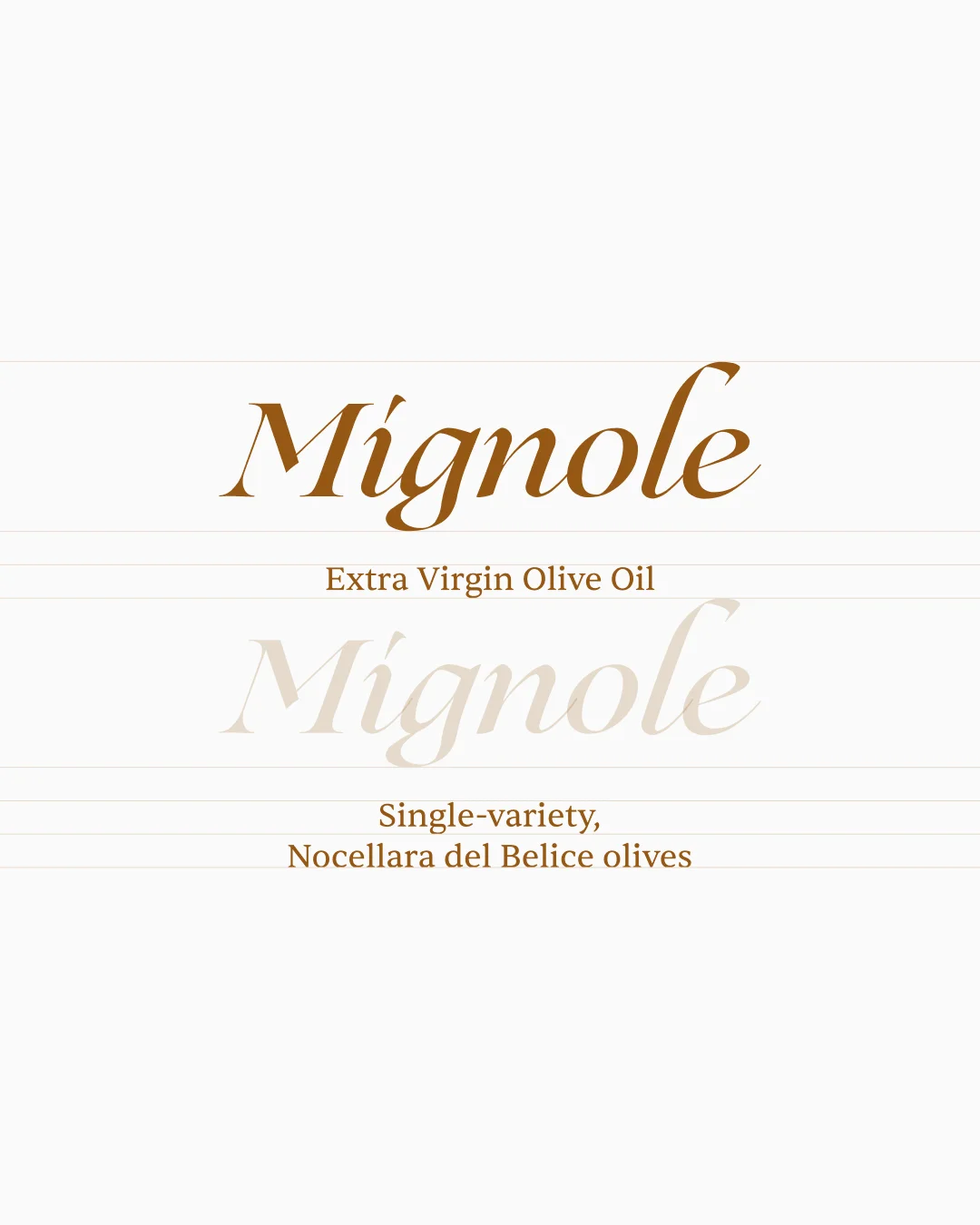
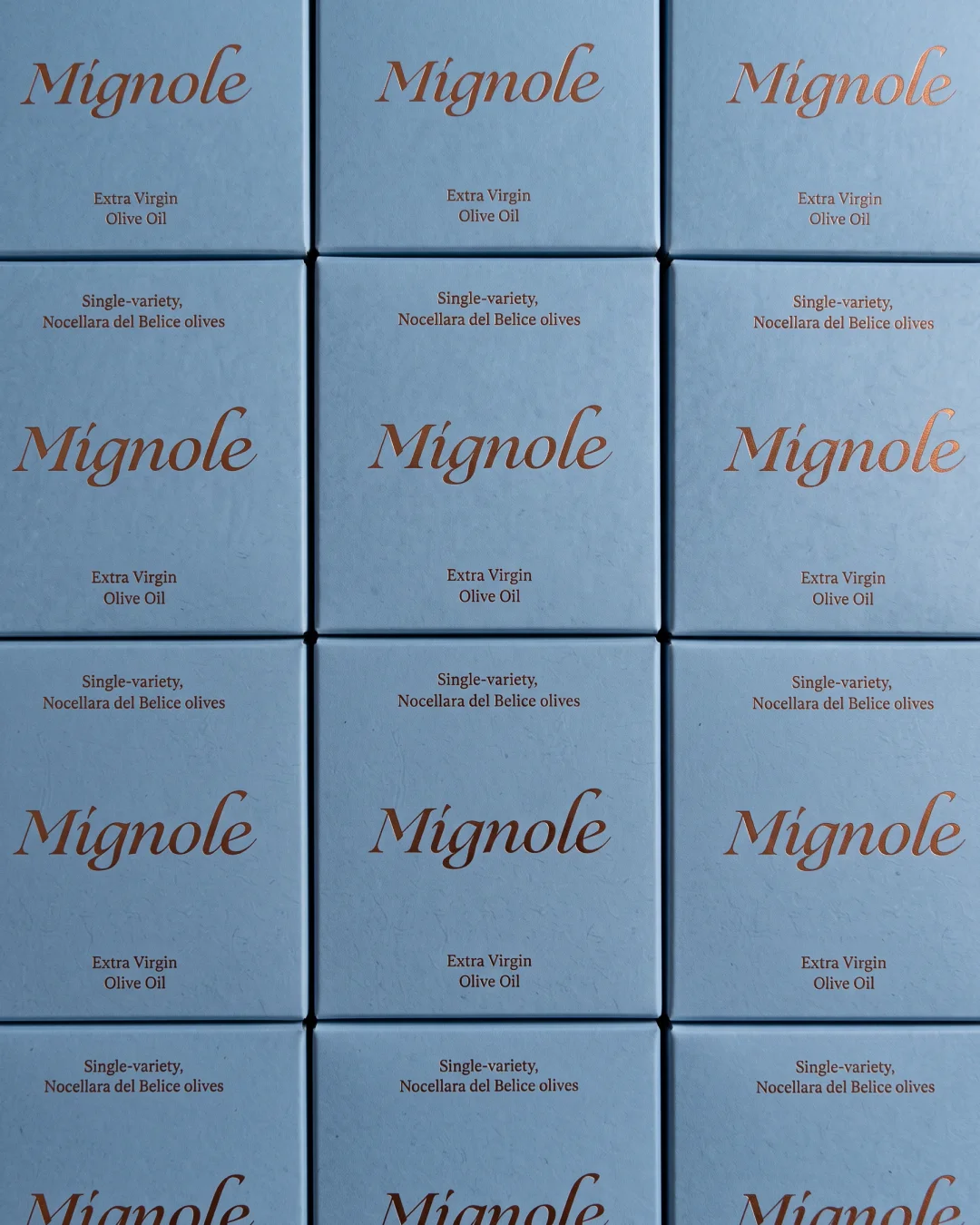
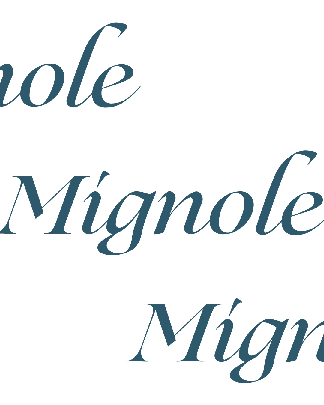
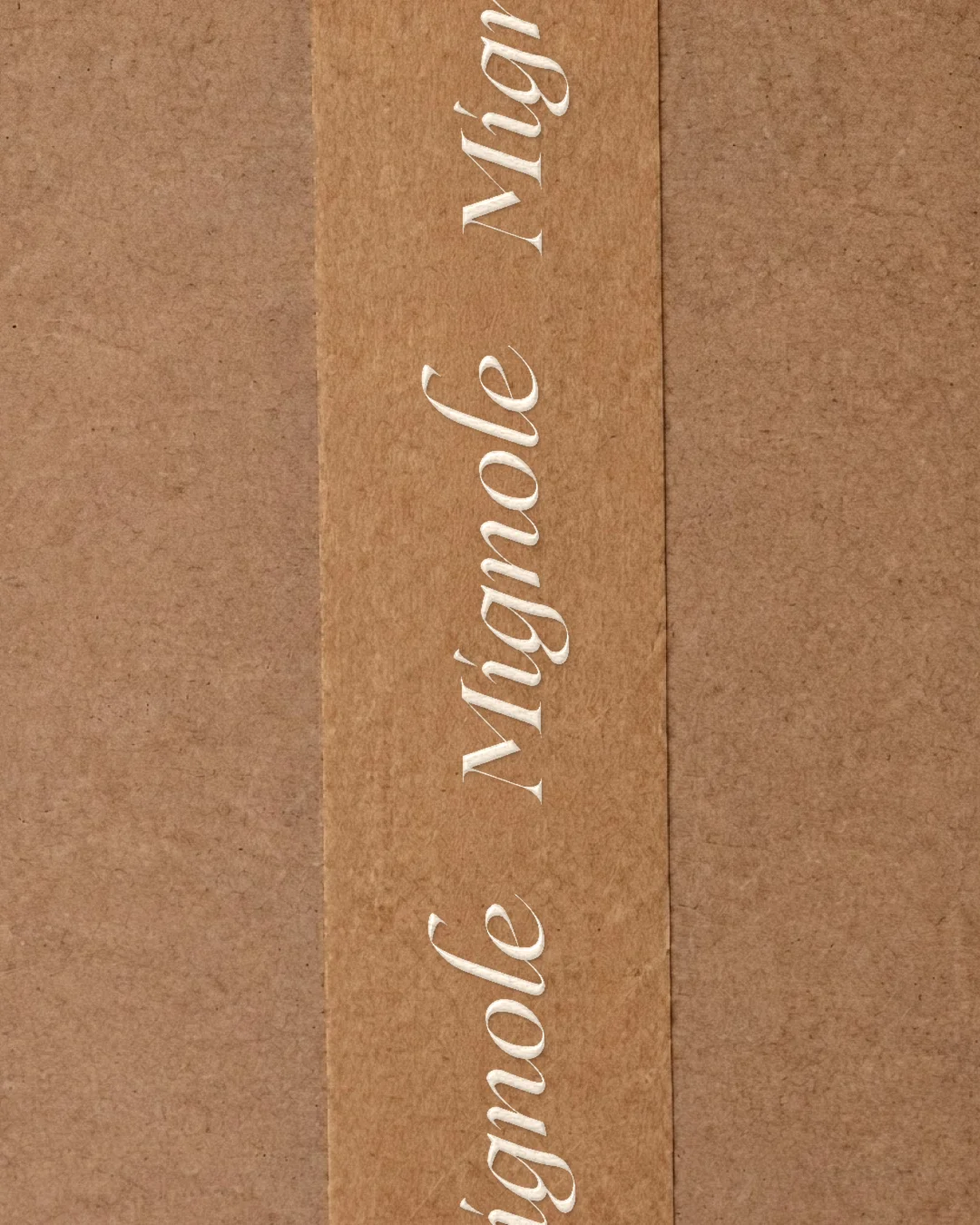
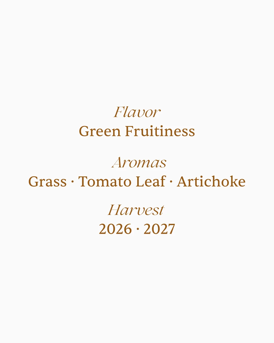
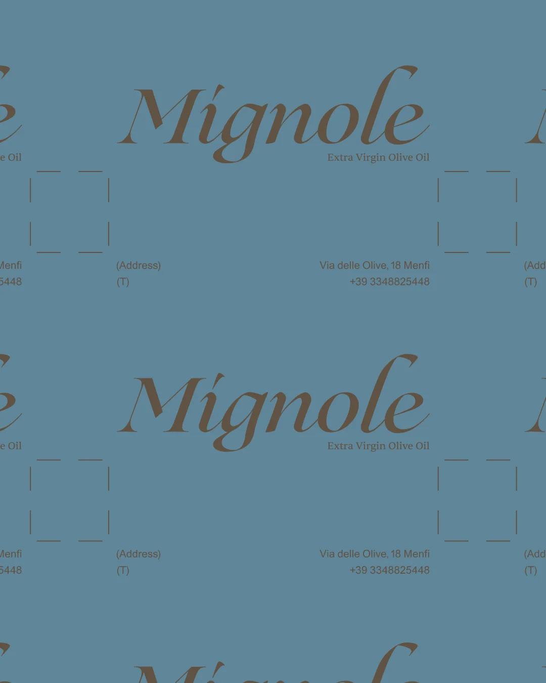
Mignole was born from the desire to give olive oil a new visual identity. Despite being a widely consumed product, it is often presented on shelves through recurring visual conventions. The project moves away from the category’s visual clichés (green, gold and overly literal depictions of olives) to explore a more refined and distinctive visual language.
The identity draws inspiration from the landscape where the product originates: the blue of the sky and the copper tones of the earth become the colours of a warm, tactile visual universe. Both the packaging and the name tell this story through the olive tree’s blossom rather than its fruit. A symbolic choice that shifts the focus to a stage that is often overlooked, yet fundamental: the quality of olive oil begins long before production, at the very moment the flower blooms.
- Year
- 2026
Digital Strategy, Website Design, Brand Identity
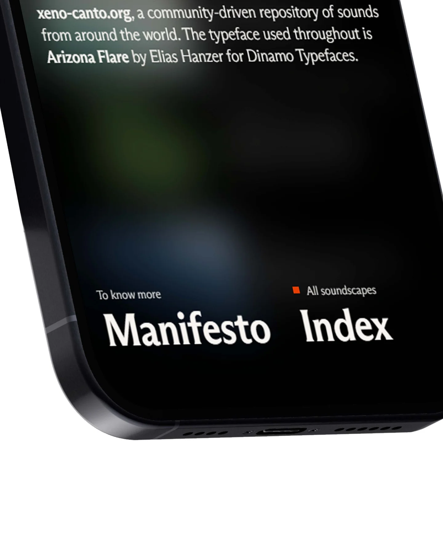
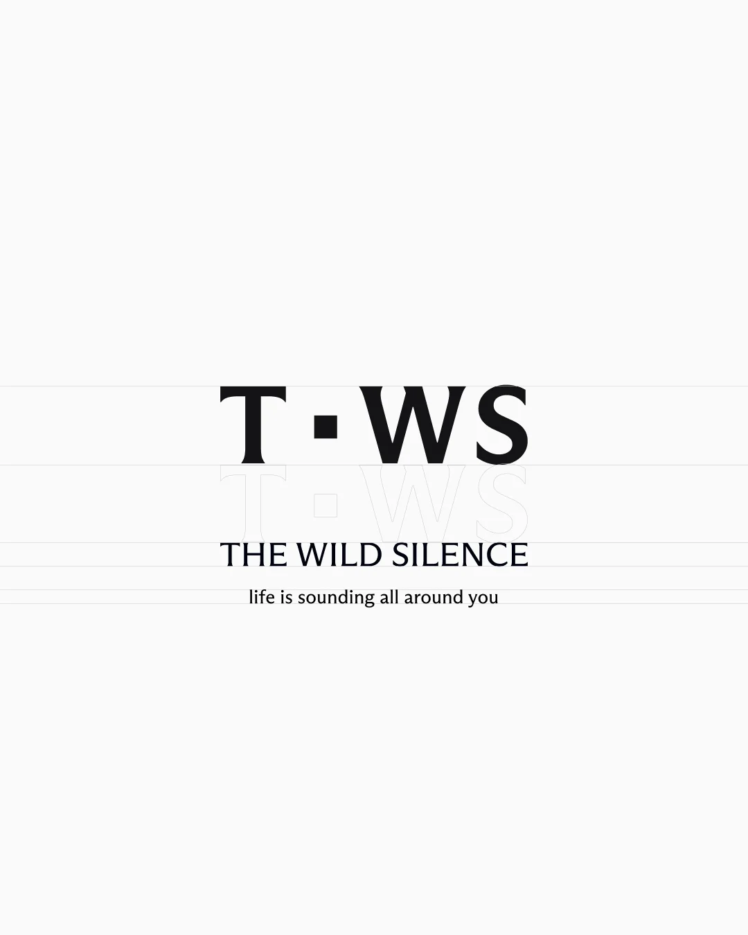
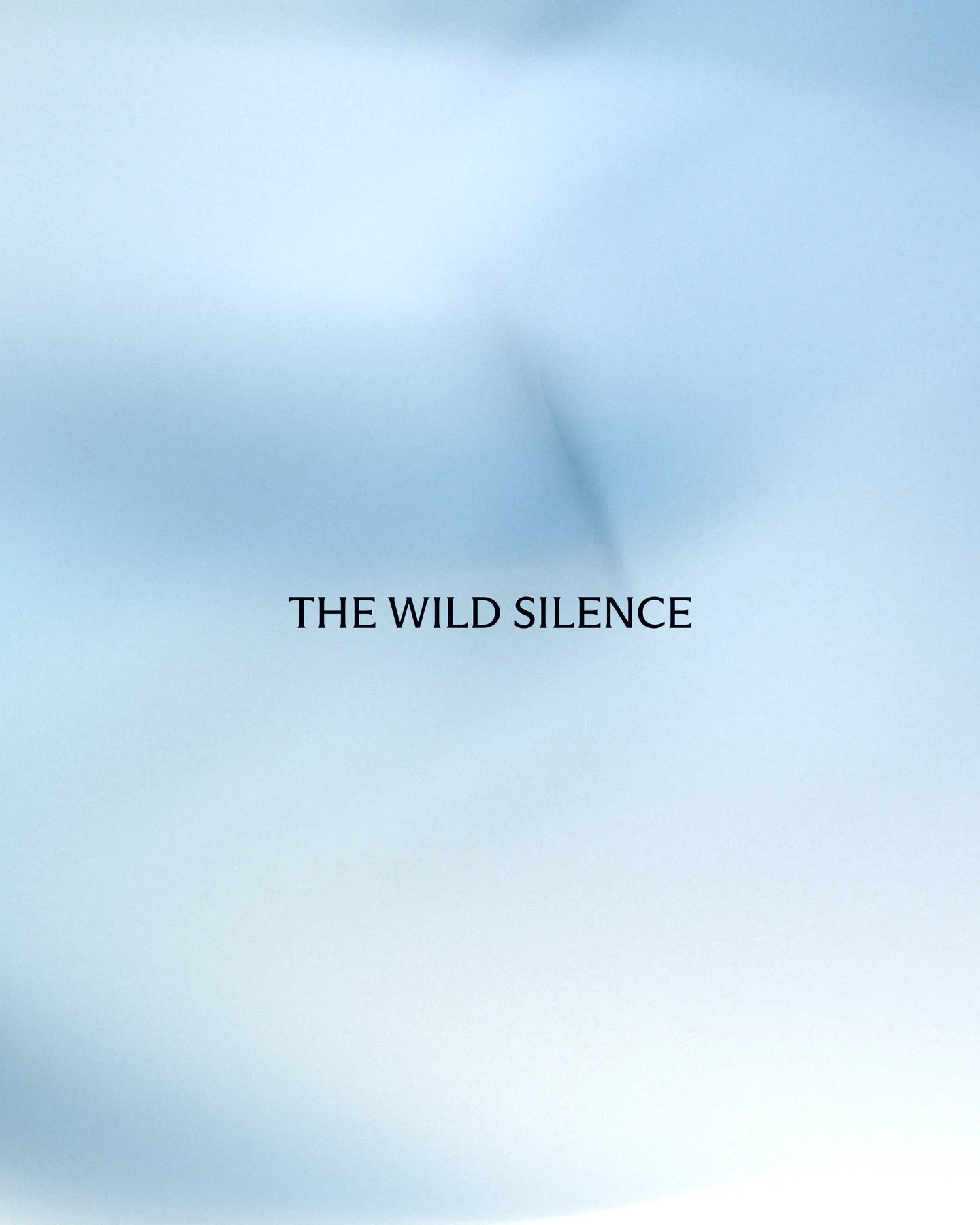
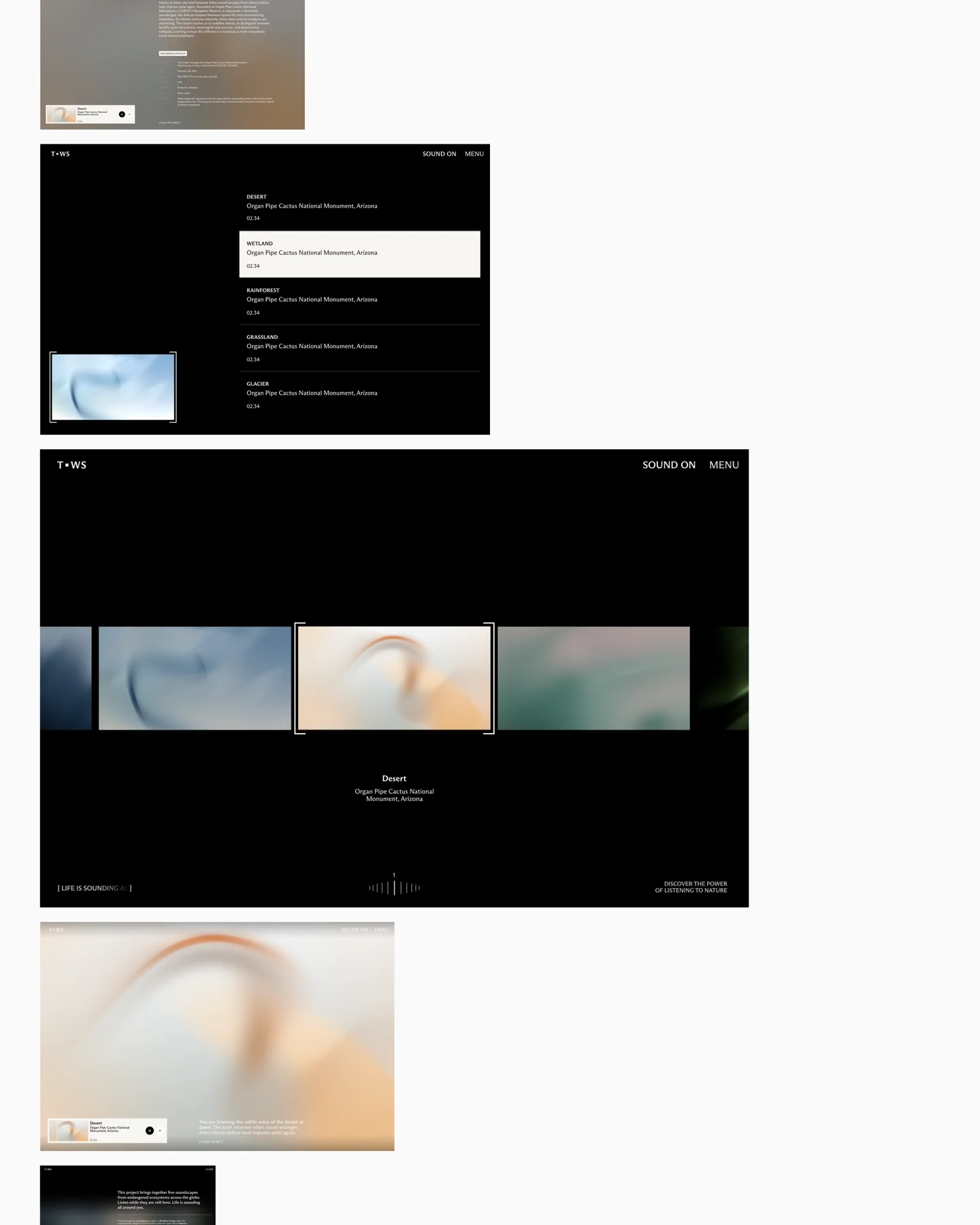
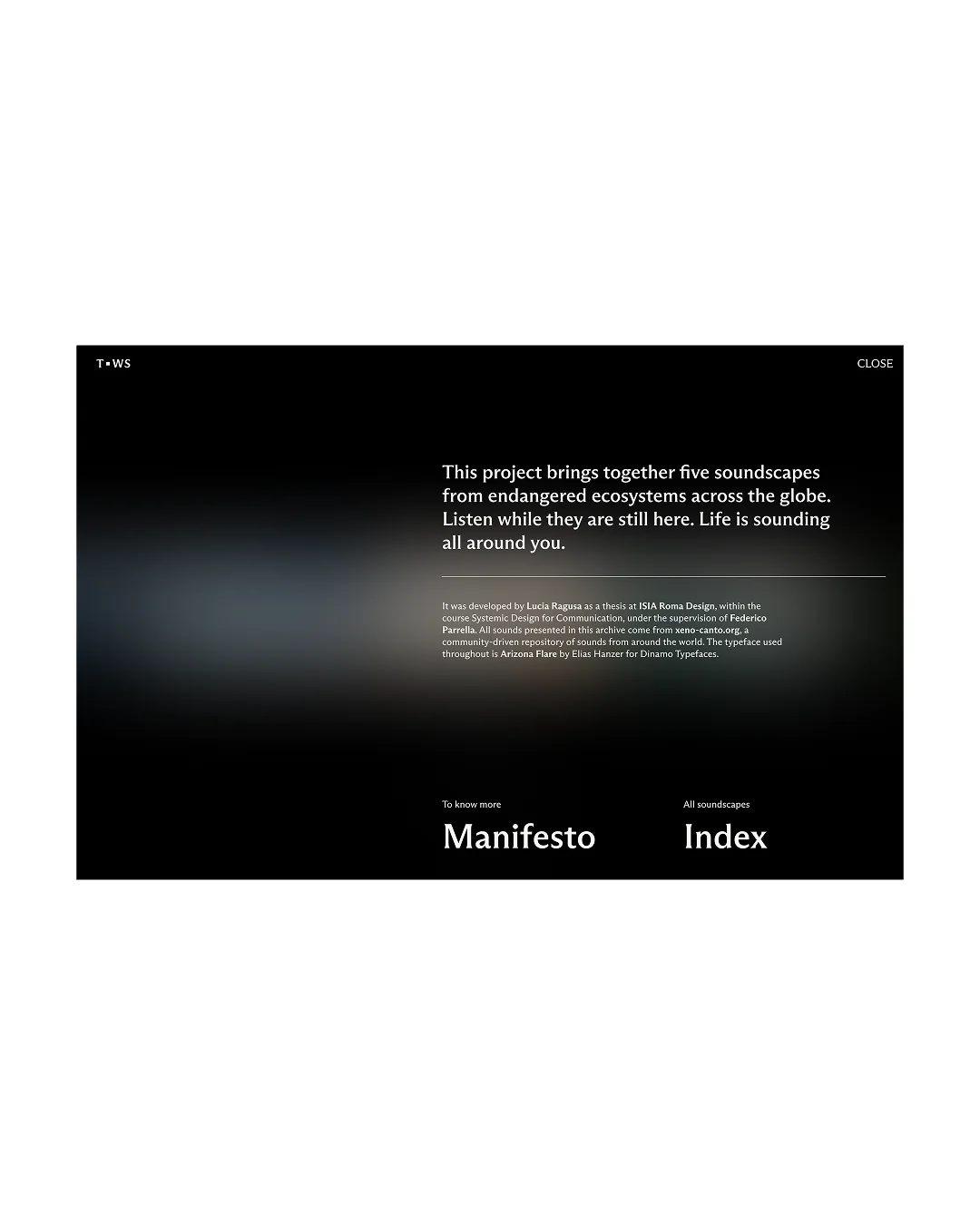
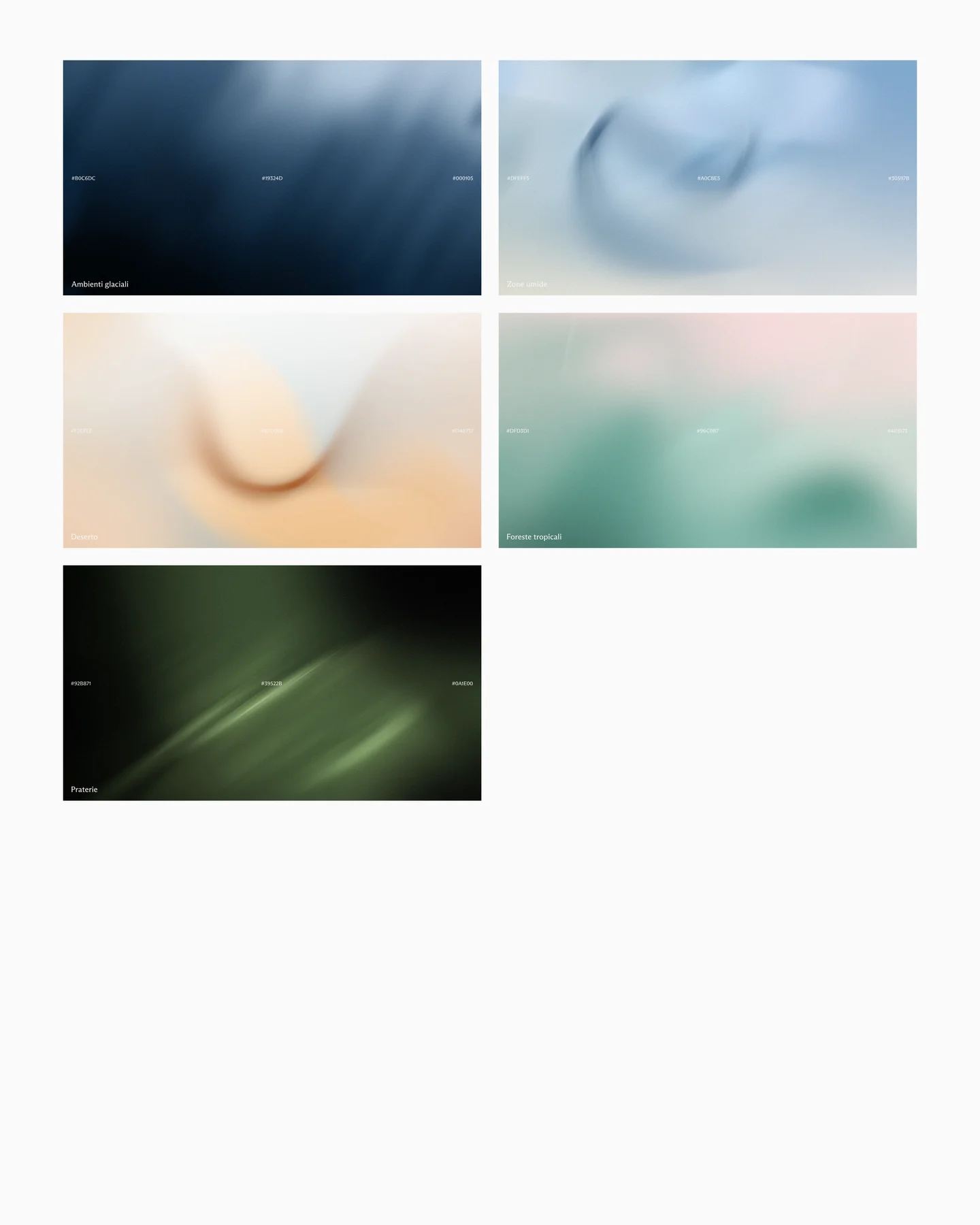
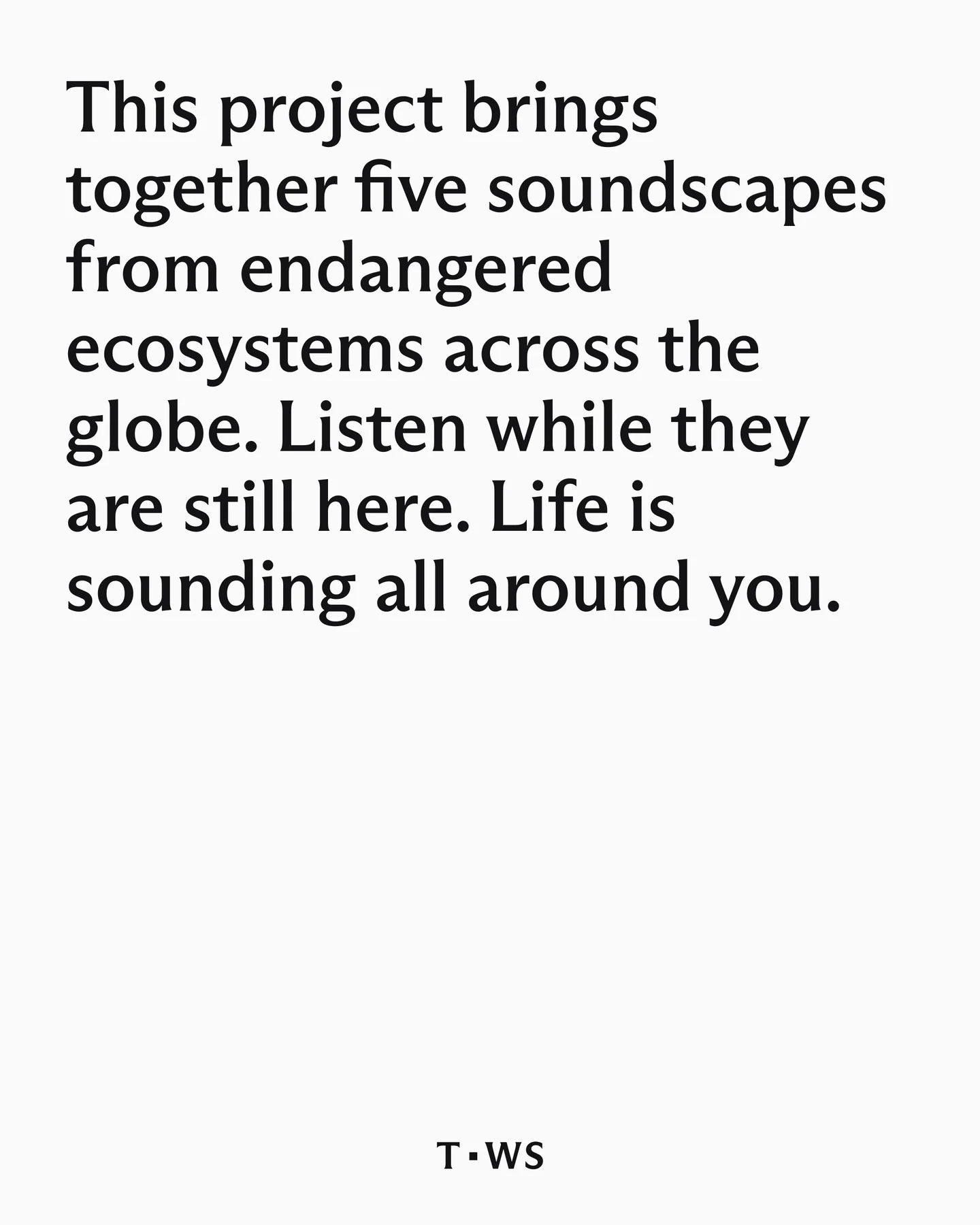
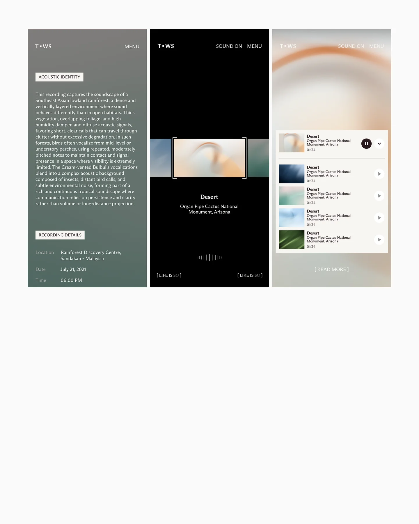
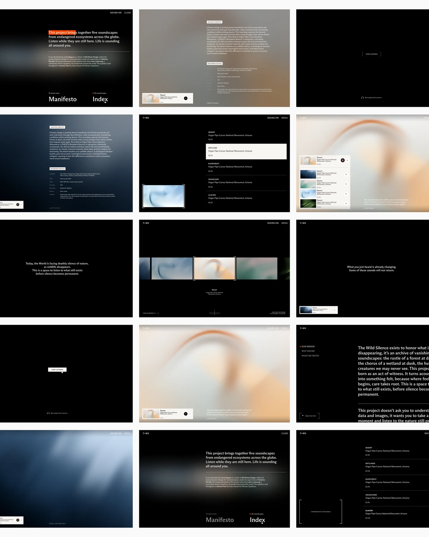
The Wild Silence is an immersive digital experience that explores the relationship between sight, sound and the natural world. Conceived as a response to the speed and superficiality that often define our interaction with screens, the project invites users to slow down and reconnect with their surroundings through a more mindful digital experience.
Using visual immersion and sound as its primary tools, The Wild Silence addresses the climate crisis from a different perspective. Rather than relying on the pessimistic narratives often associated with environmental communication, it offers a poetic reflection on what is still worth protecting. Through imagery and the sounds of nature that continue to exist, the experience transforms the screen into a space for awareness, contemplation and reconnection.
- Year
- 2026
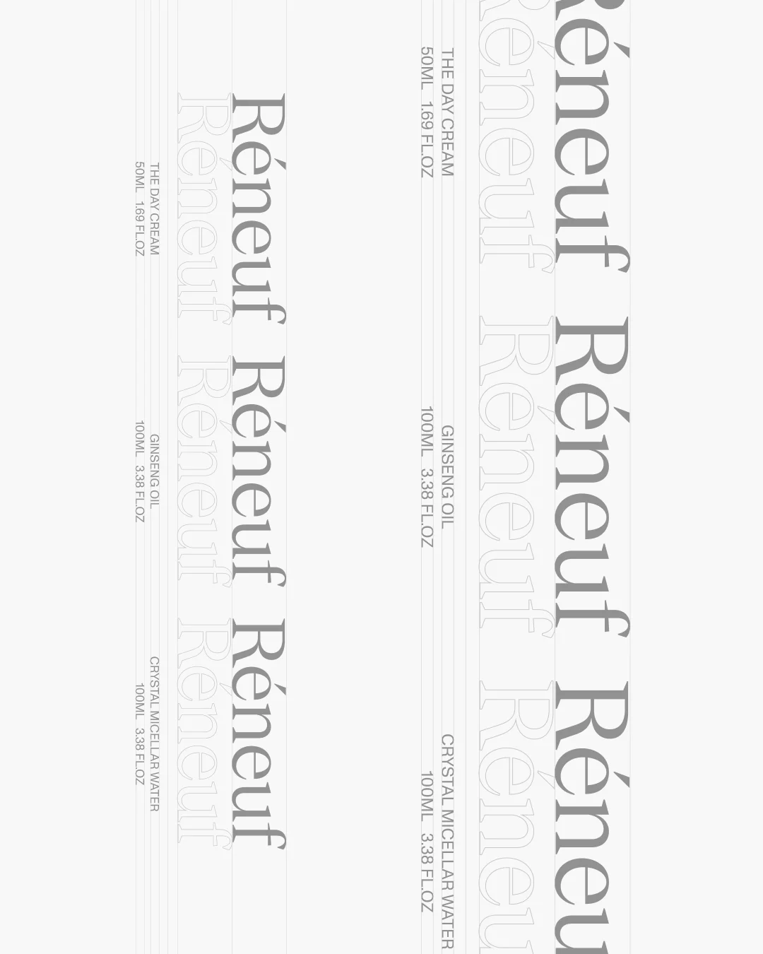
Creative Direction, Brand Identity, Packaging Design, Website
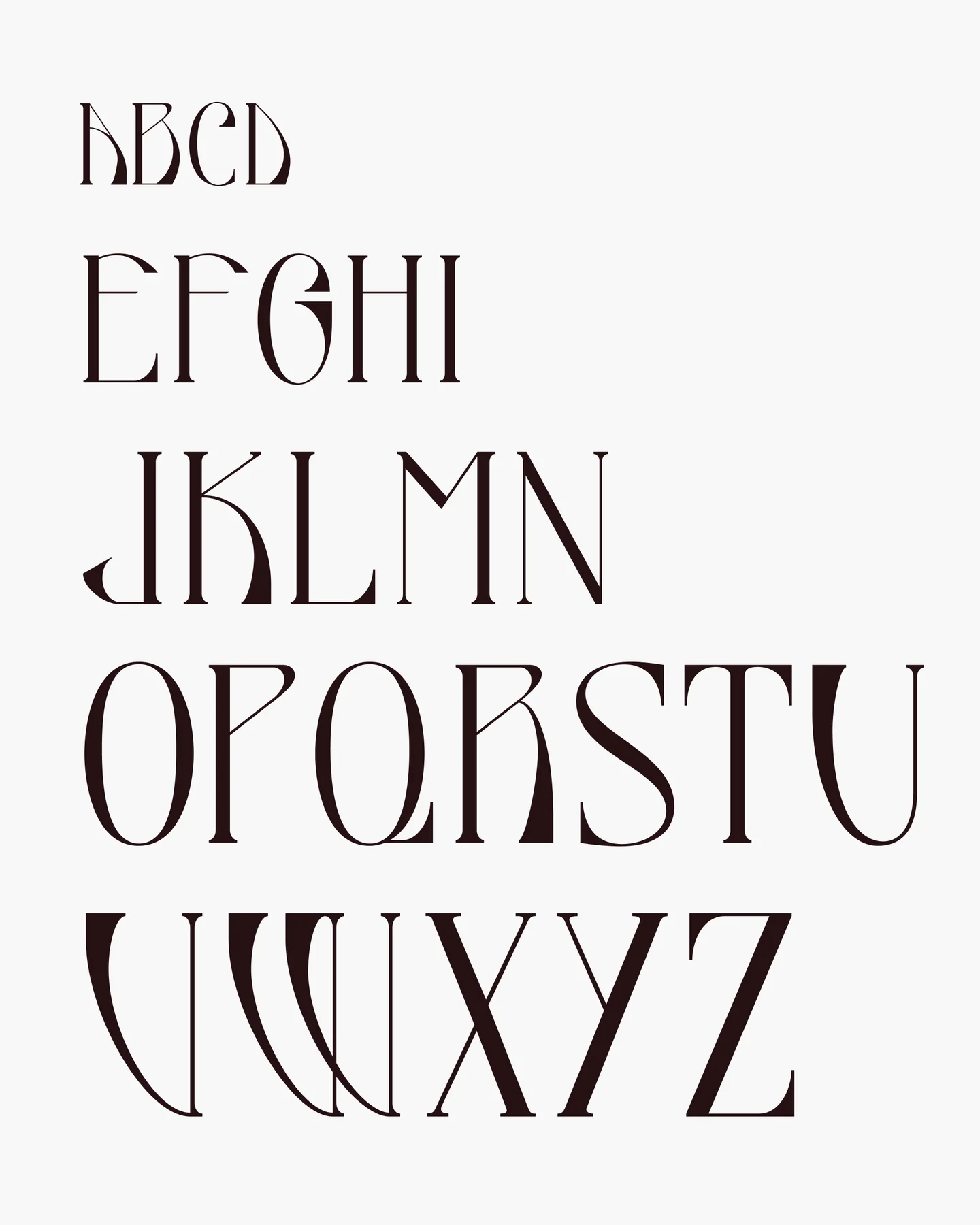
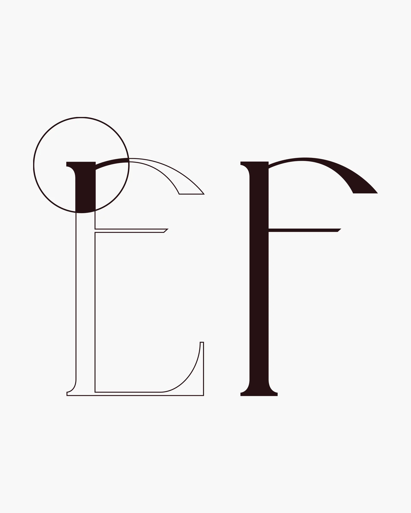
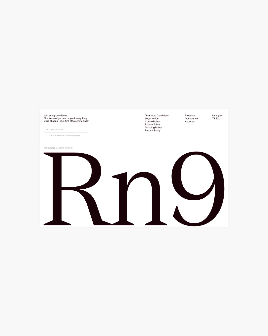
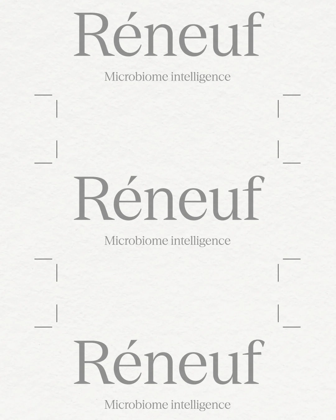
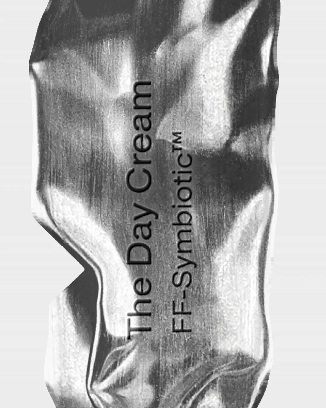
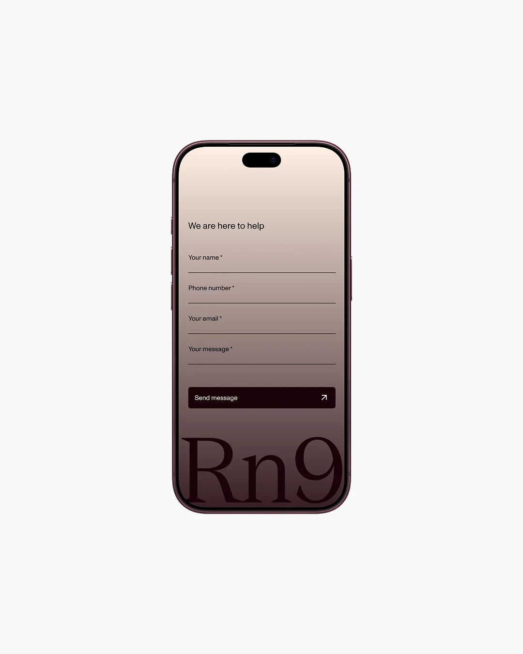
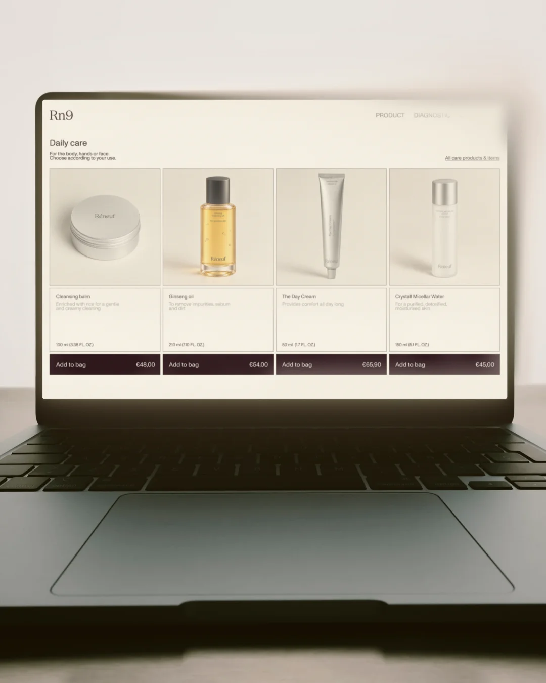
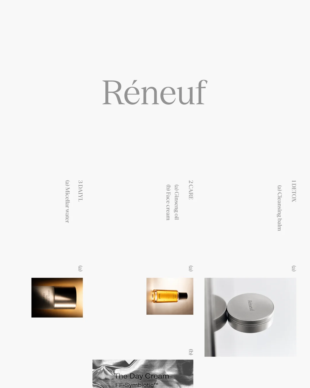
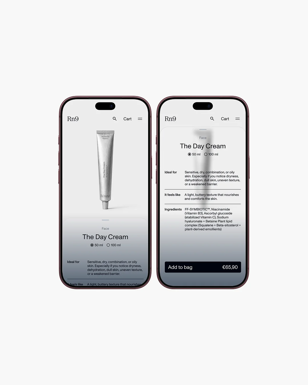
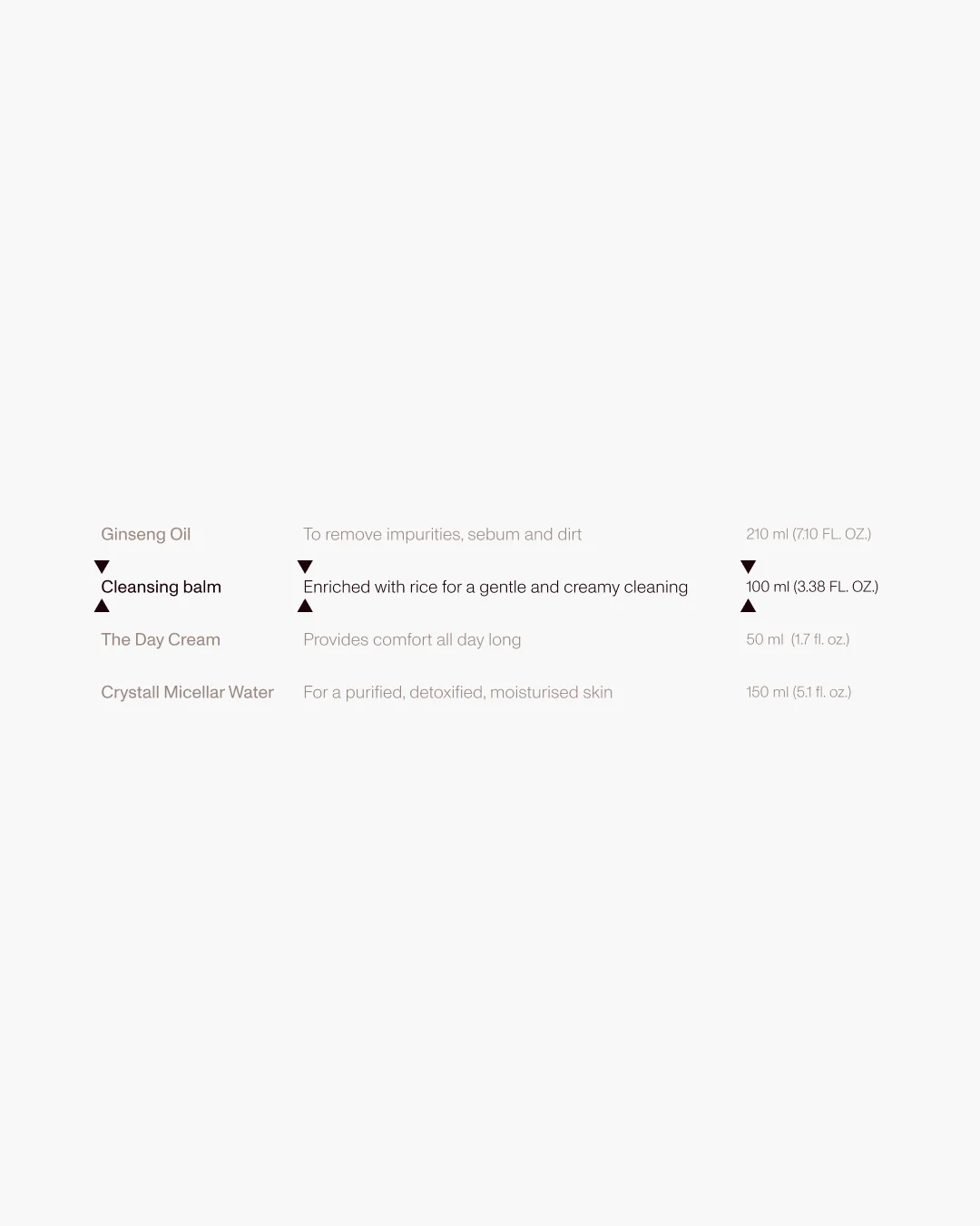
In an increasingly saturated beauty market, Reneuf was conceived to express an idea of beauty rooted in science and ingredient quality. The project moves away from the industry’s visual conventions and overly decorative aesthetics, building an identity that is minimal, precise and contemporary.
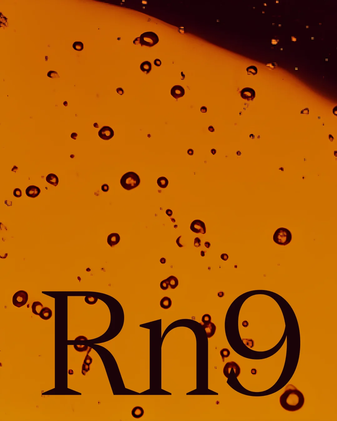
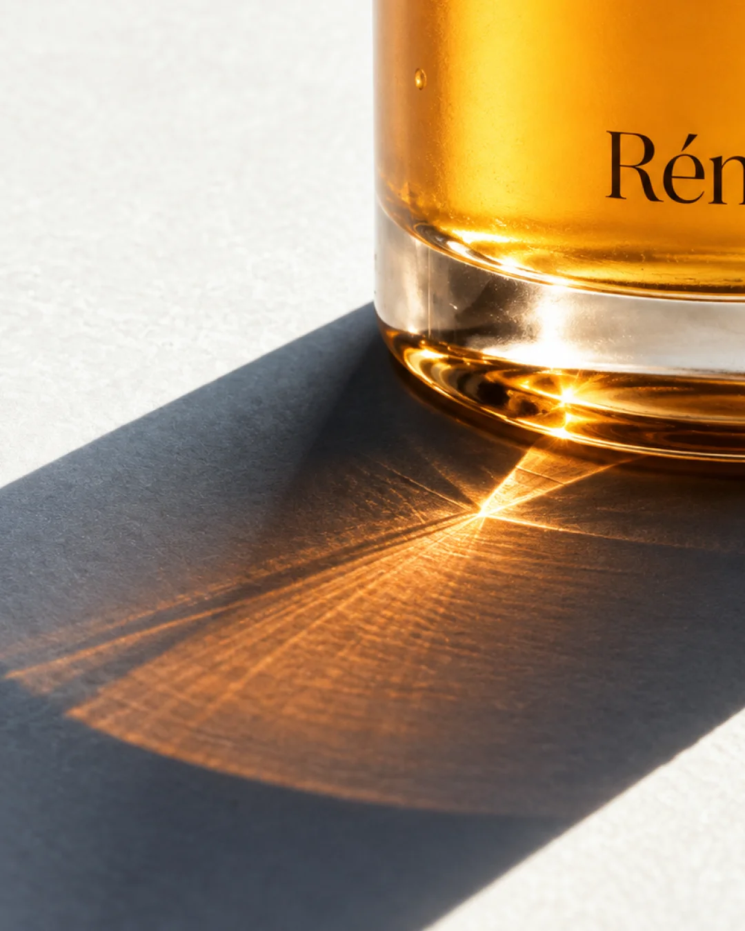
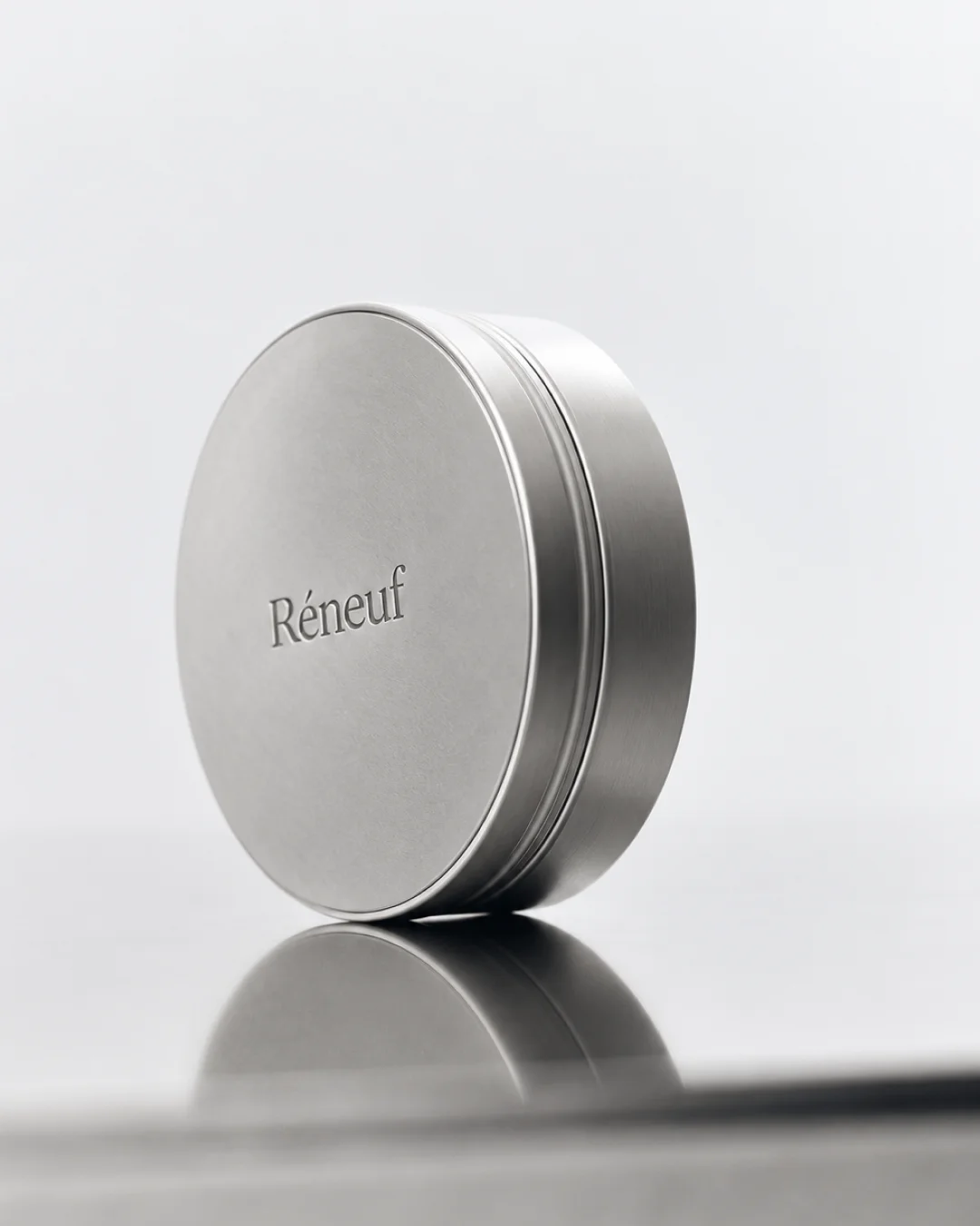
Ingredient quality becomes the focal point of the visual language: textures are explored through macro photography, packaging features clean forms and graphic elements are reduced to their essentials. Every element is designed to leave room for the materials, the research and the qualities of the product itself.
Reneuf is built around a simple belief: in a market where everyone is competing for attention, standing out does not necessarily mean being louder. Sometimes, the strongest choice is to remain true to your essence.
- Year
- 2026
Creative Direction, Brand Identity, Website
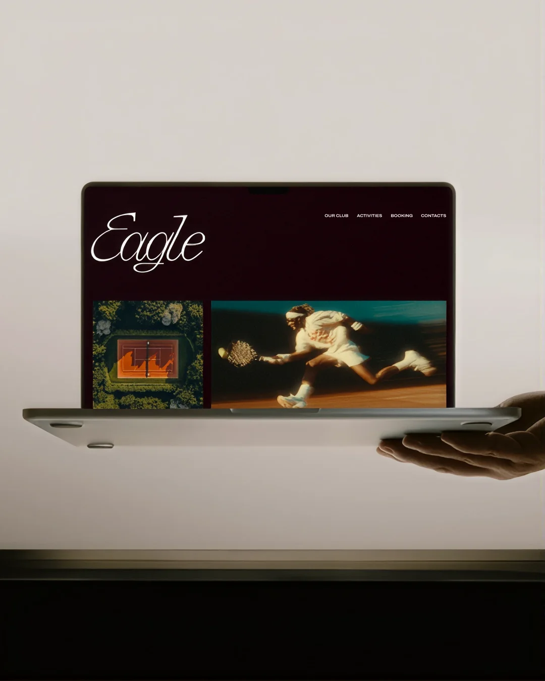
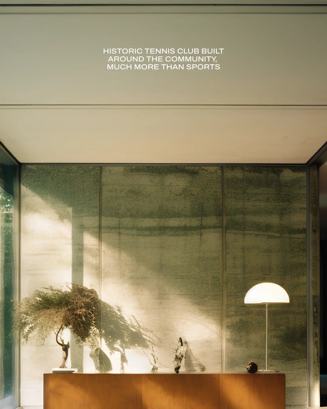
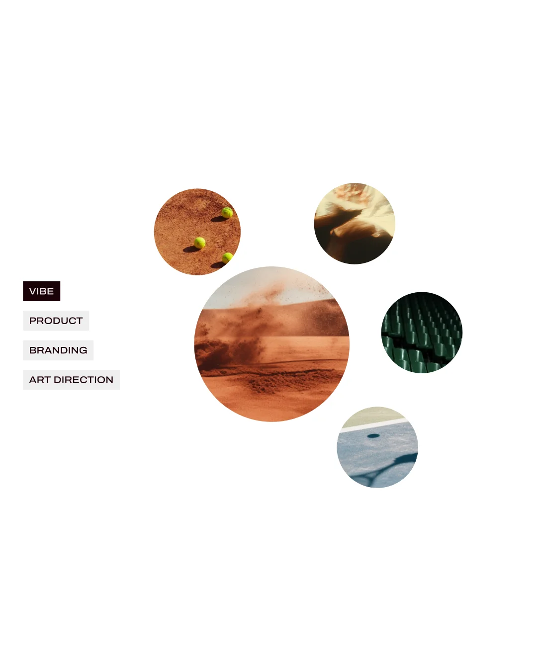
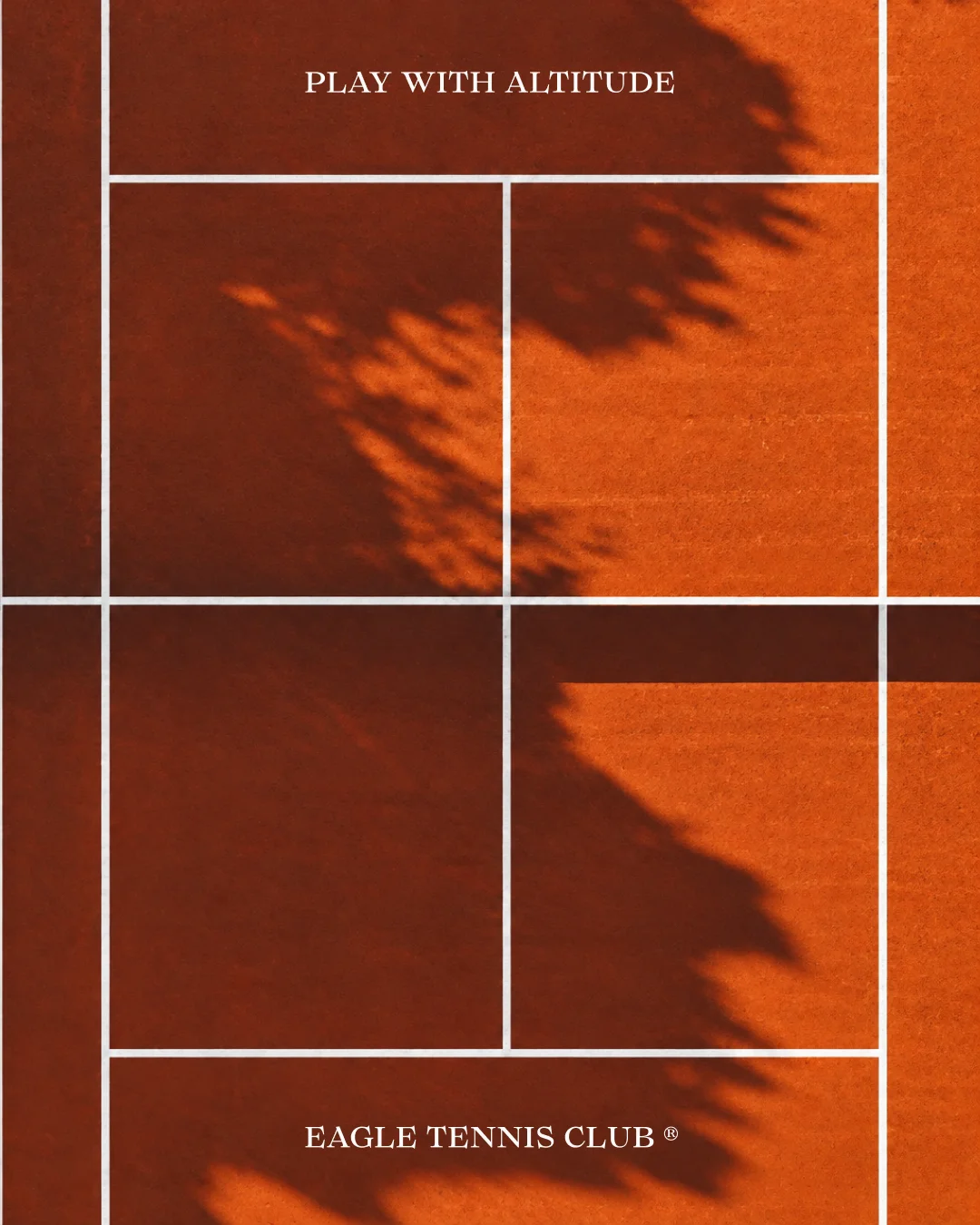
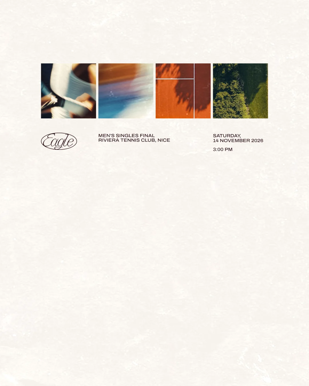
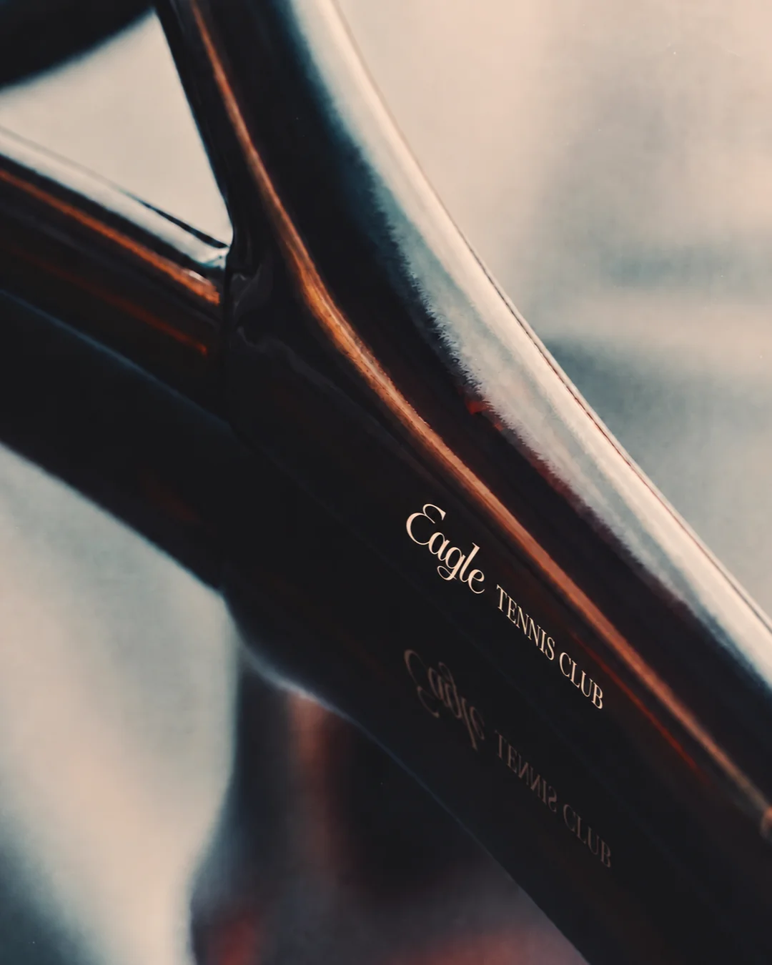
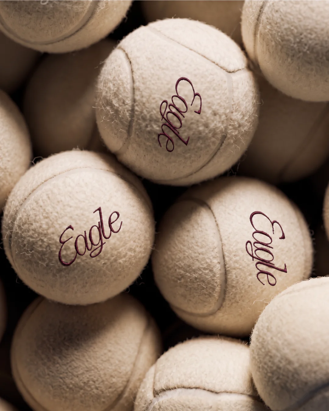
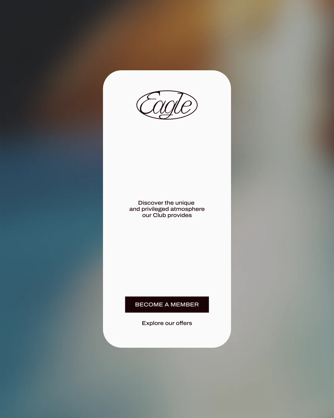
Eagle reimagines the visual language of sports, moving beyond familiar clichés to create an identity rooted in timeless elegance and distinction. More than a sports club, Eagle represents a community shaped by shared values, a sense of belonging and a common passion.
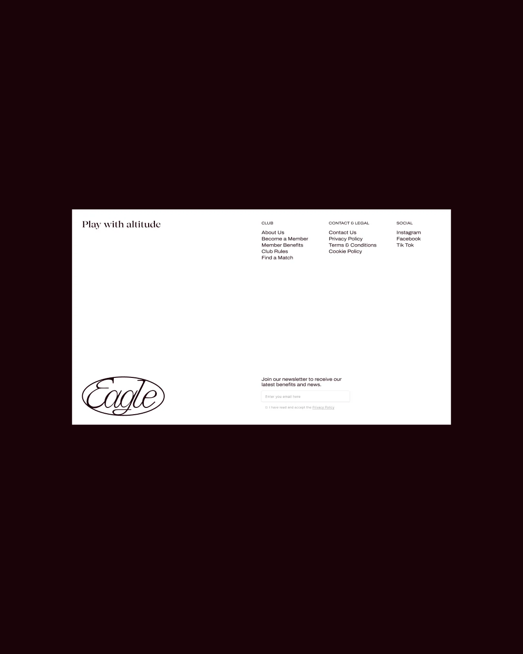
The creative direction draws on a refined, understated aesthetic, balancing the energy of sport with a more considered and enduring visual language. Brand identity and website design come together as parts of a unified system, translating the club’s character into a consistent experience across physical and digital touchpoints.
The result is an identity that goes beyond the sport itself, expressing not only what the club does, but what it stands for.
- Year
- 2026
Website Design and Development, Digital Identity
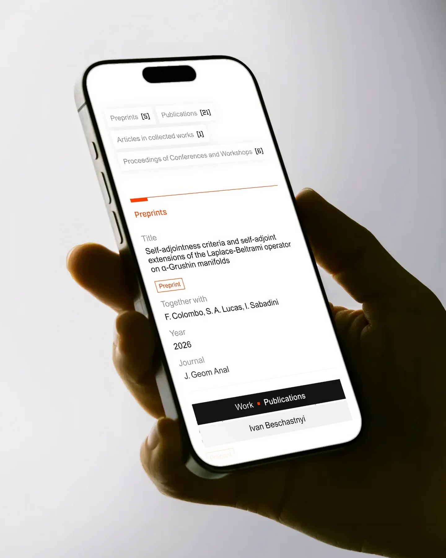
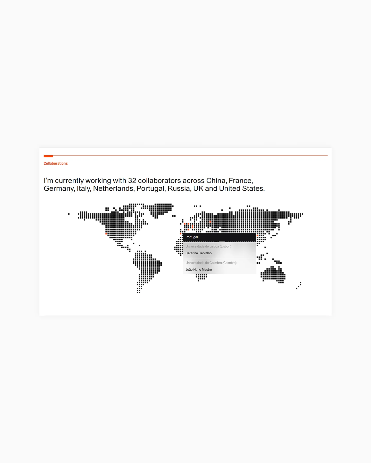
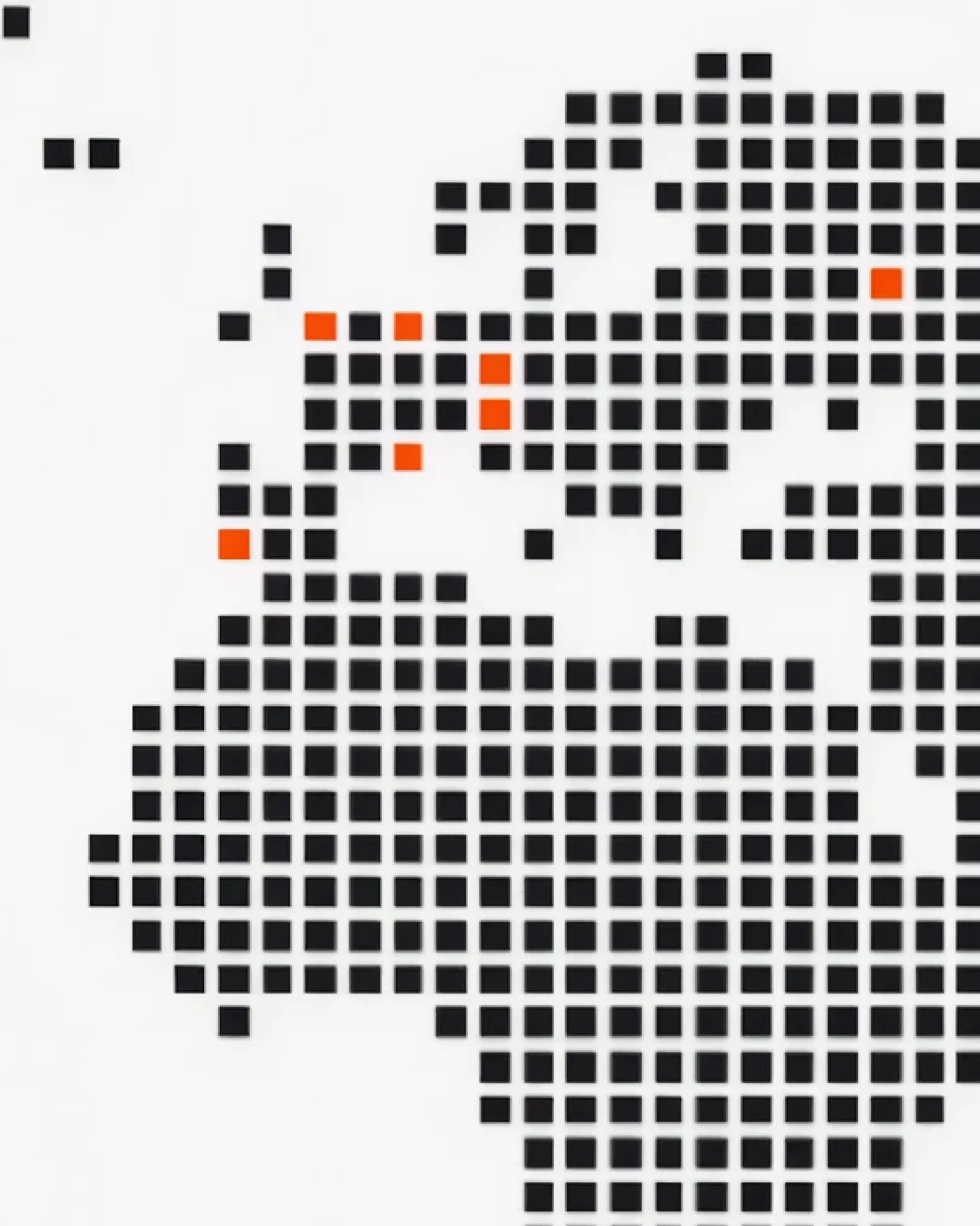
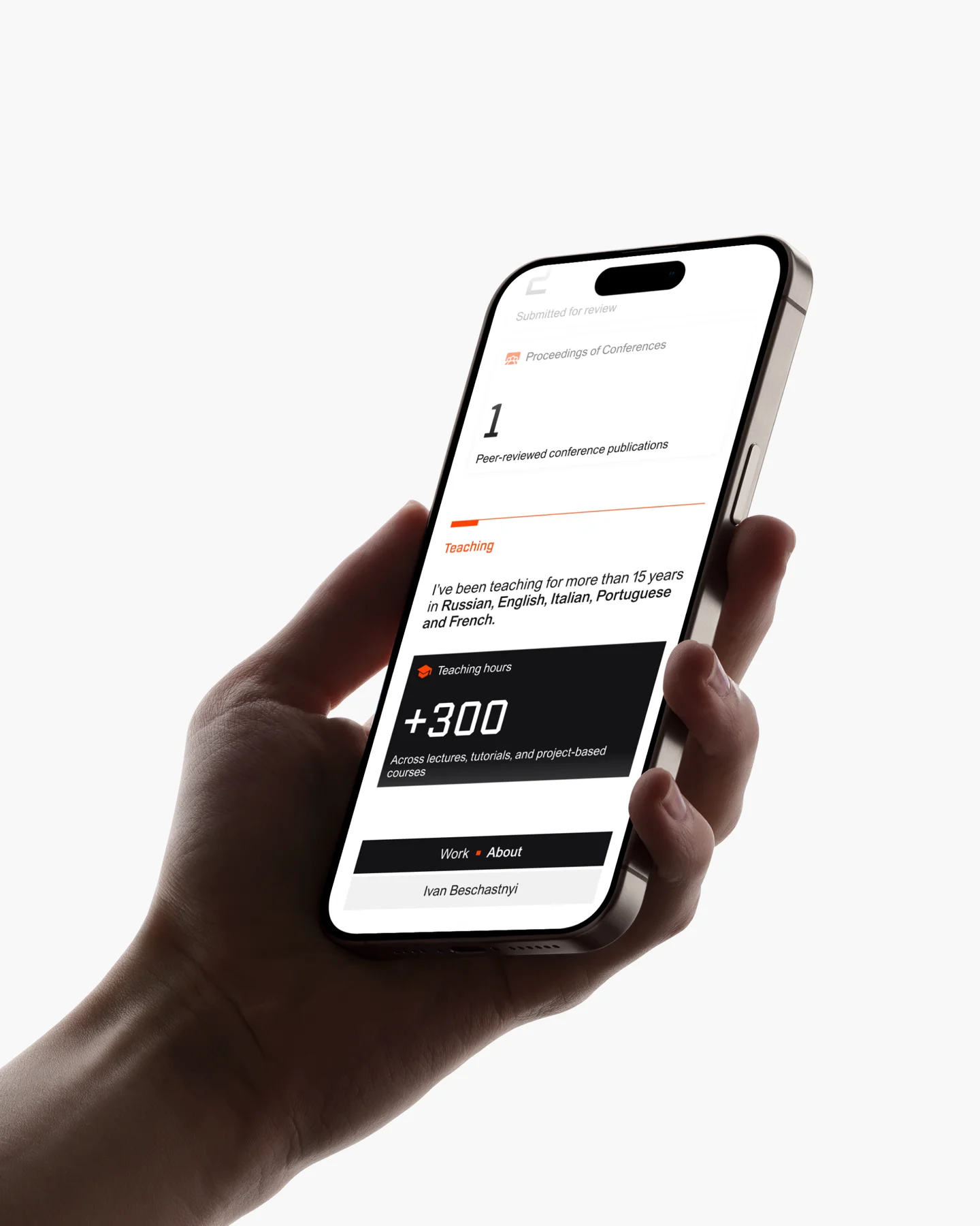
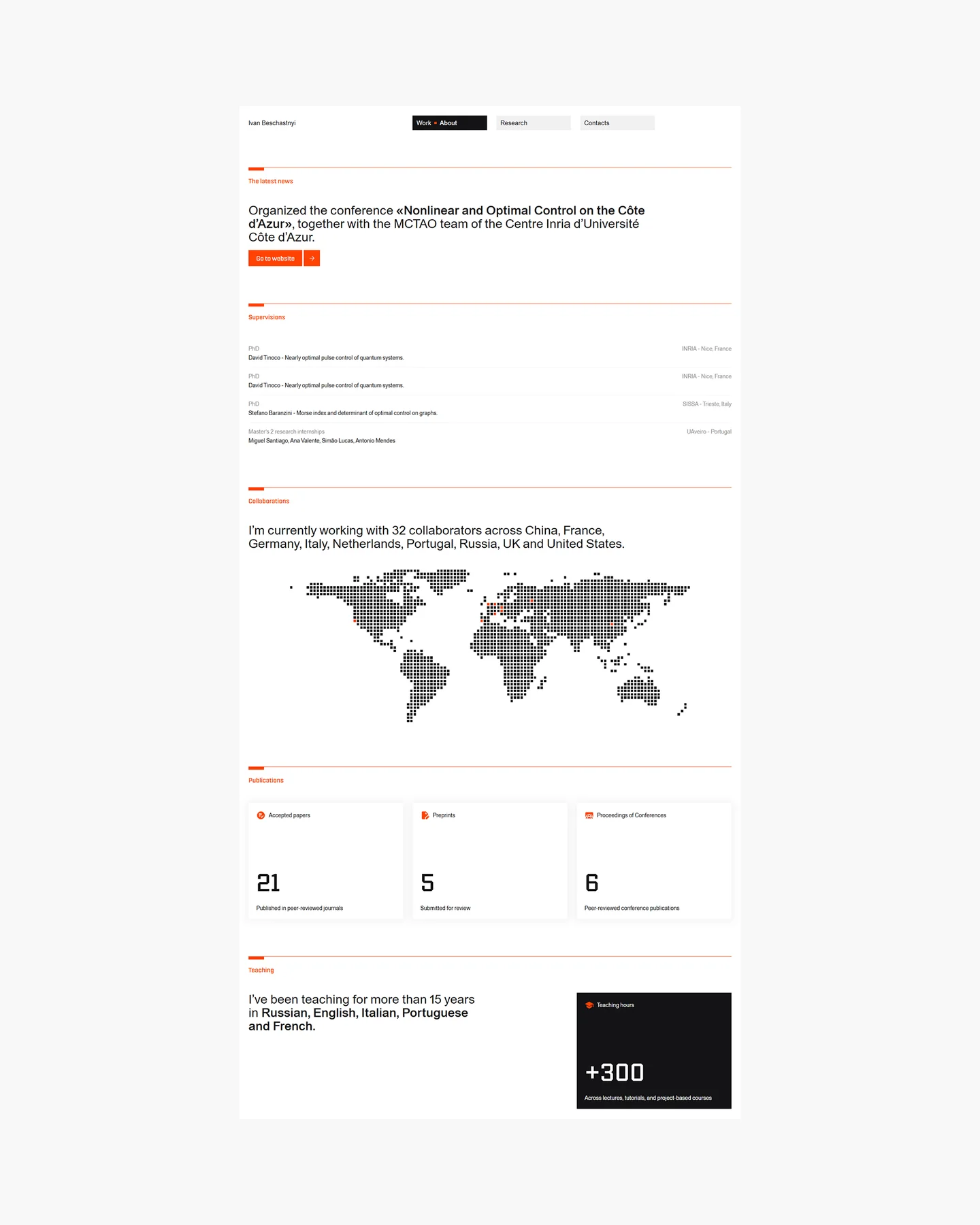
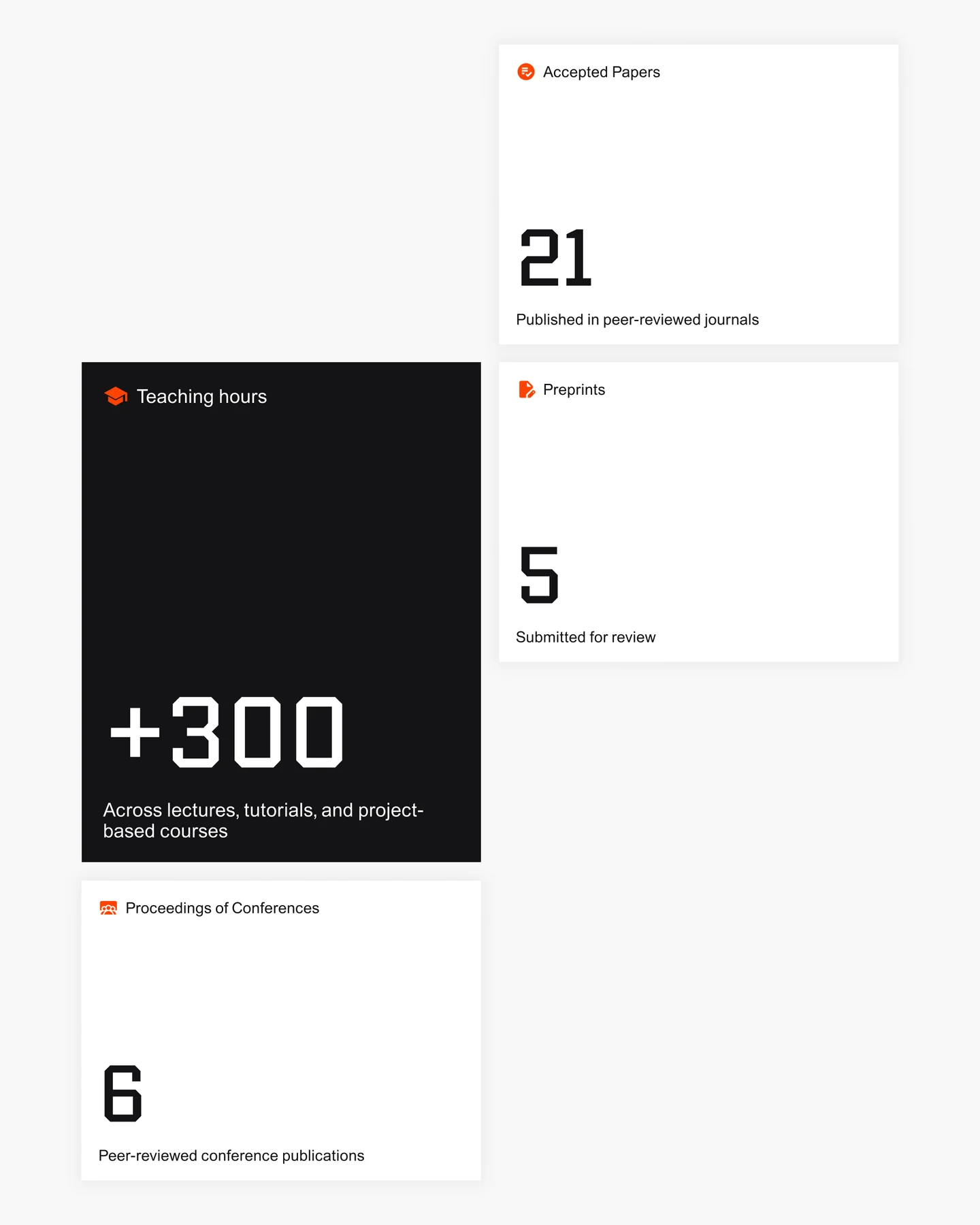
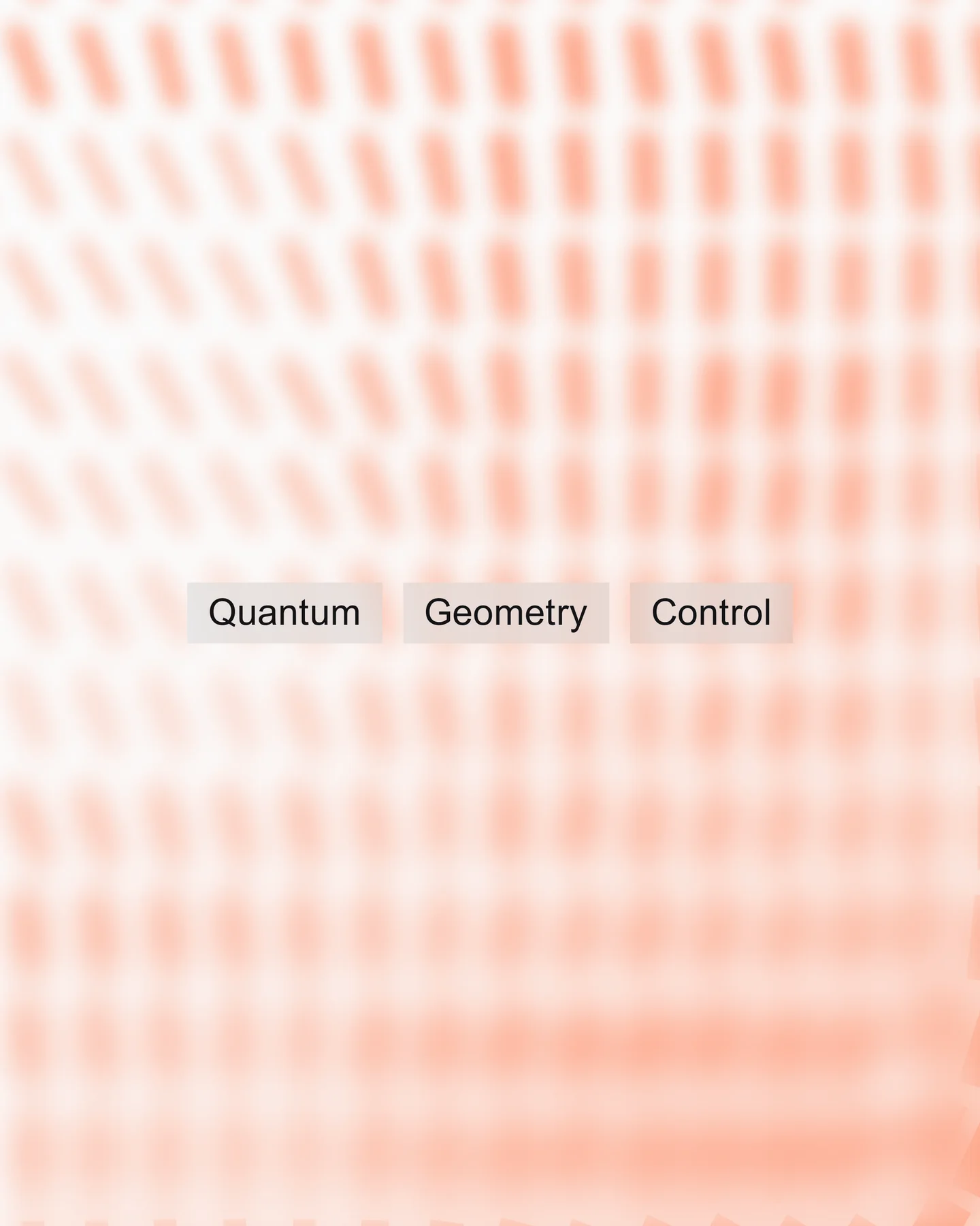
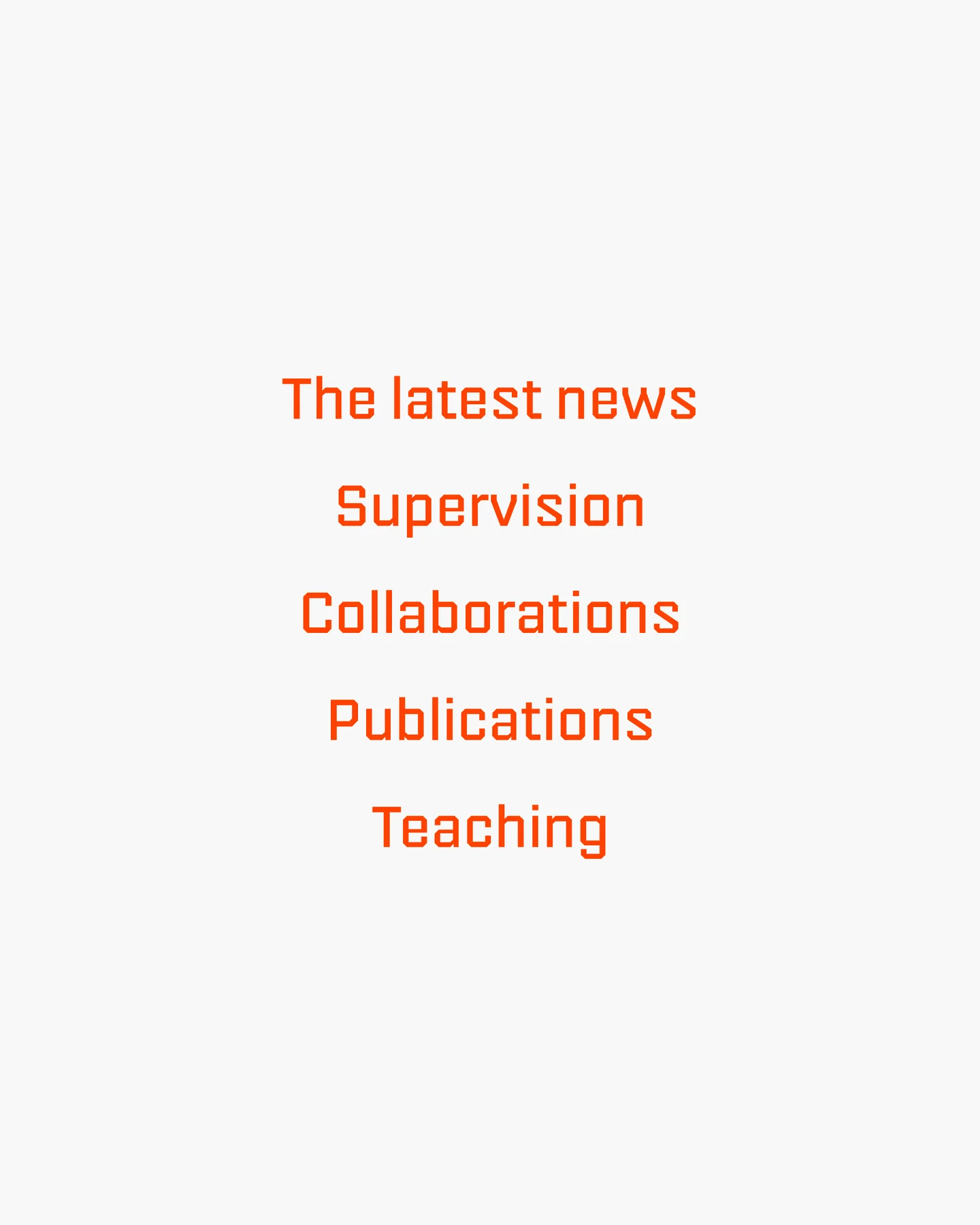
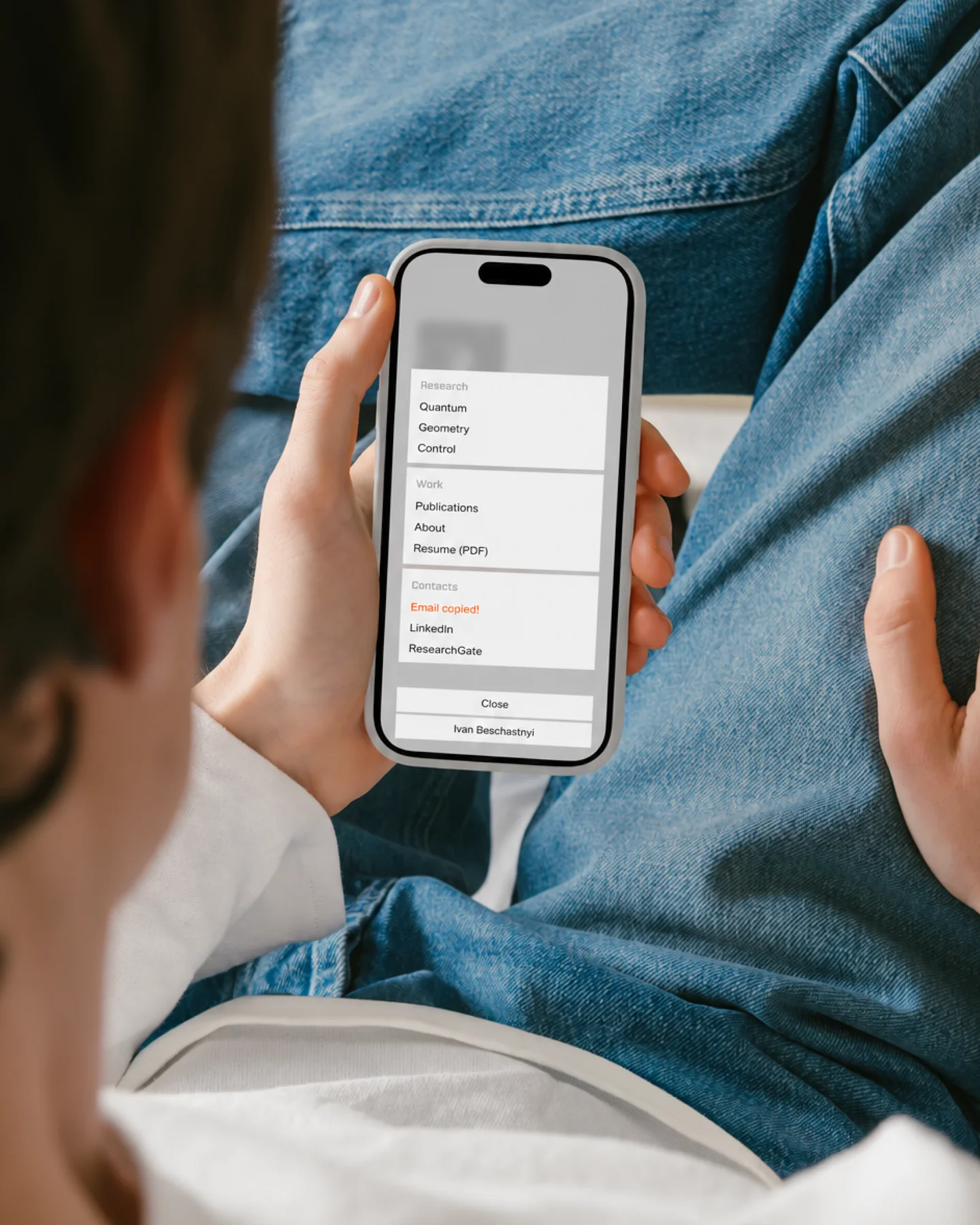
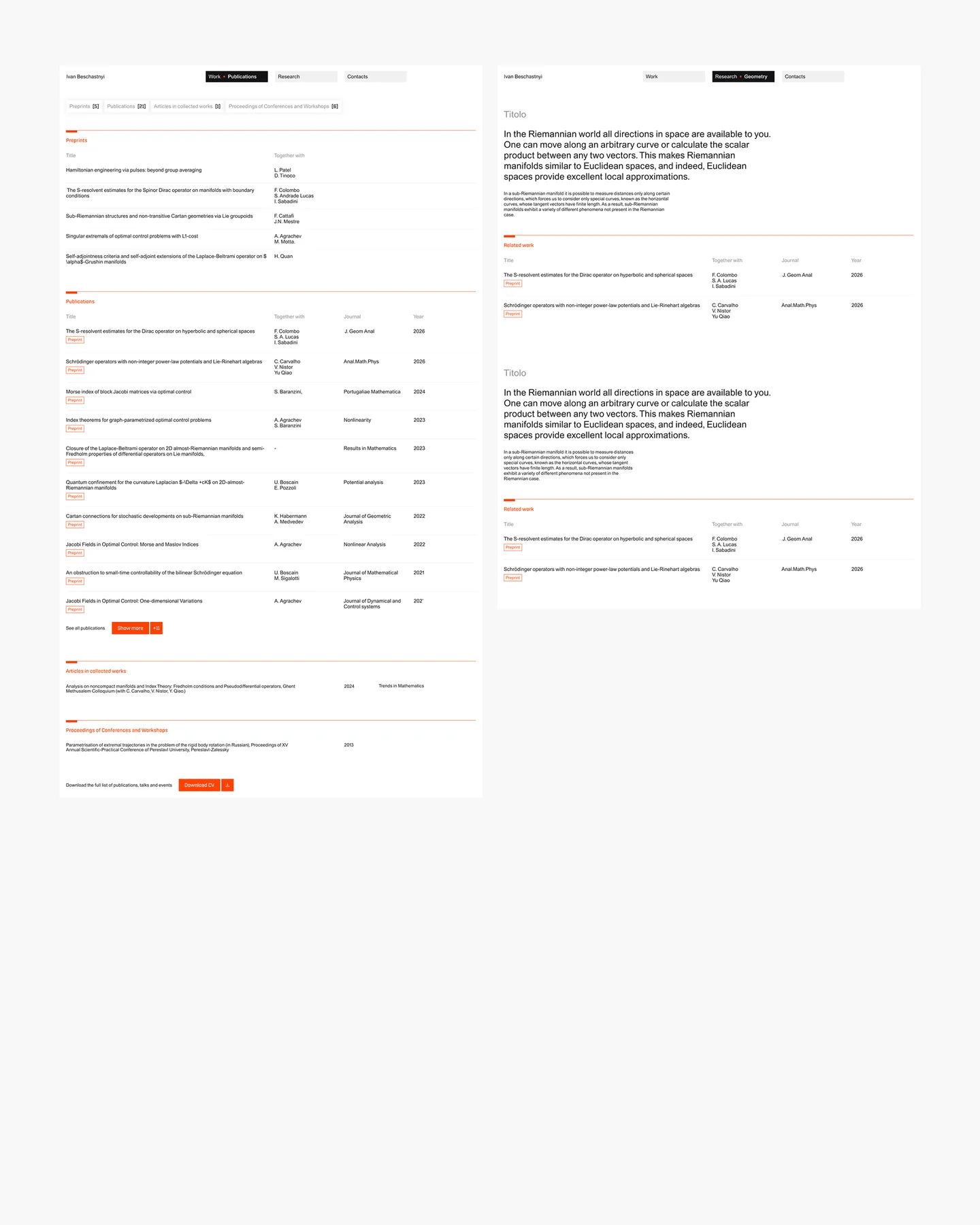
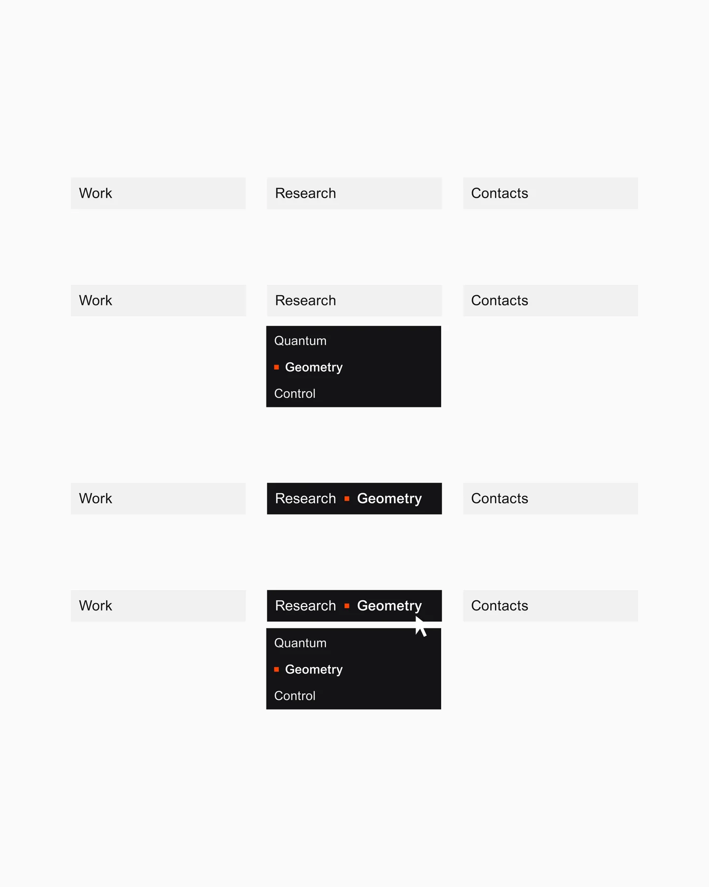
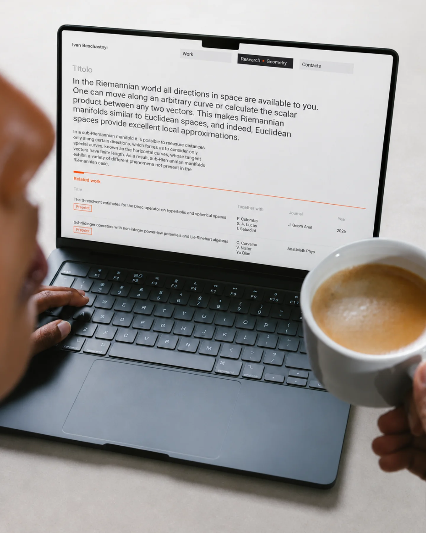
A minimal website for Ivan Beschastnyi, designed to bring a career in progress into one place. The experience balances a simple structure with a sense of movement, allowing the work to remain at the centre.
The project brings together digital identity, website design, and development. The direction uses restraint to make the portfolio easy to explore while leaving room for its character to come through.
- Year
- 2026
App Design, Brand Identity
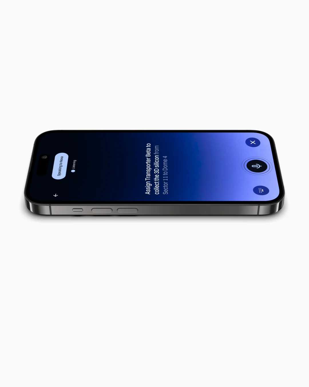
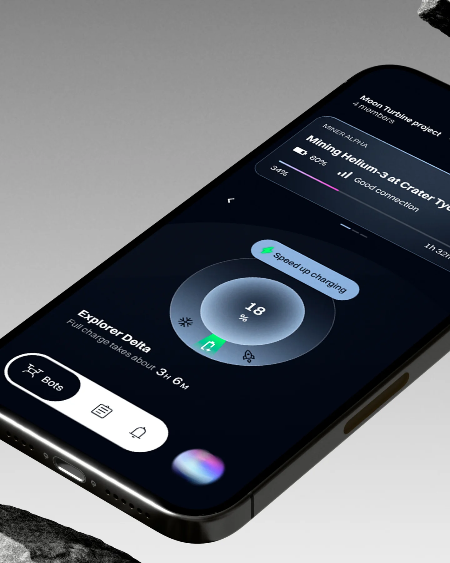
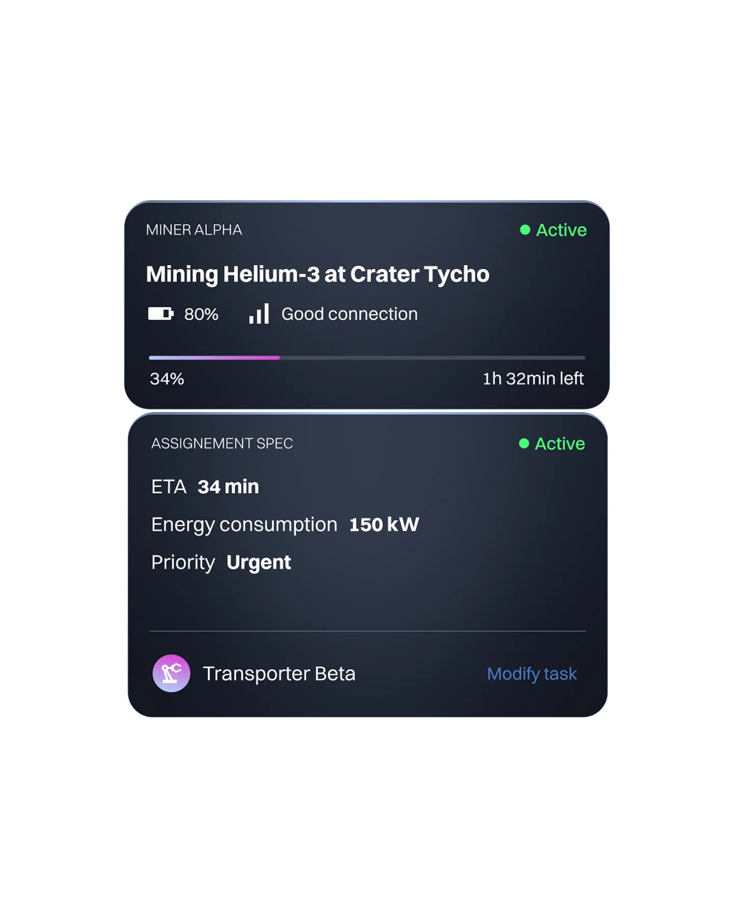
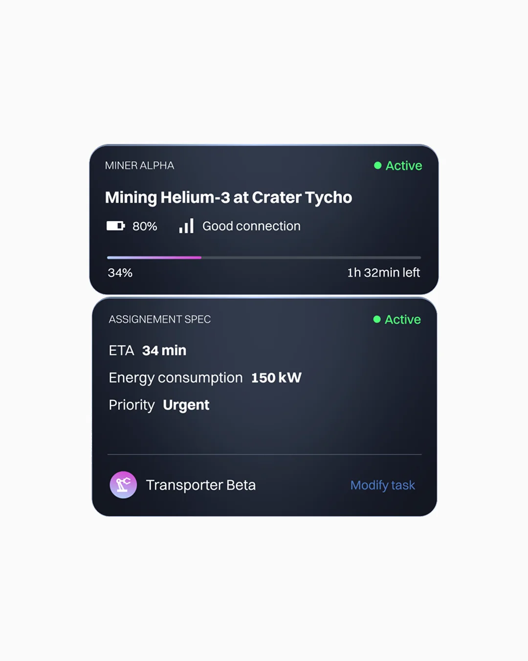
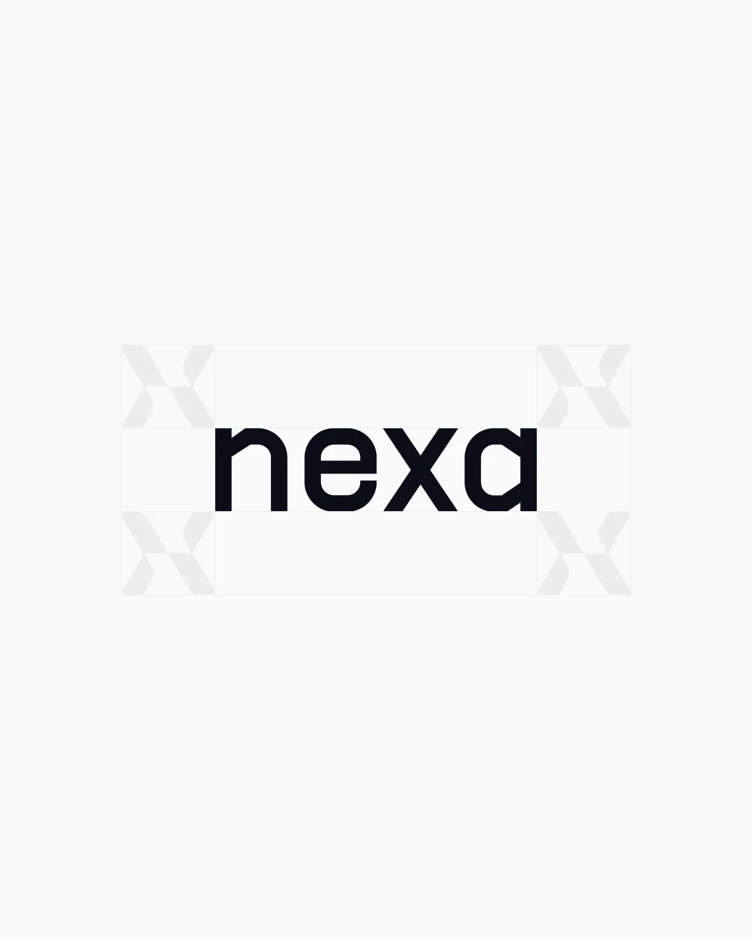
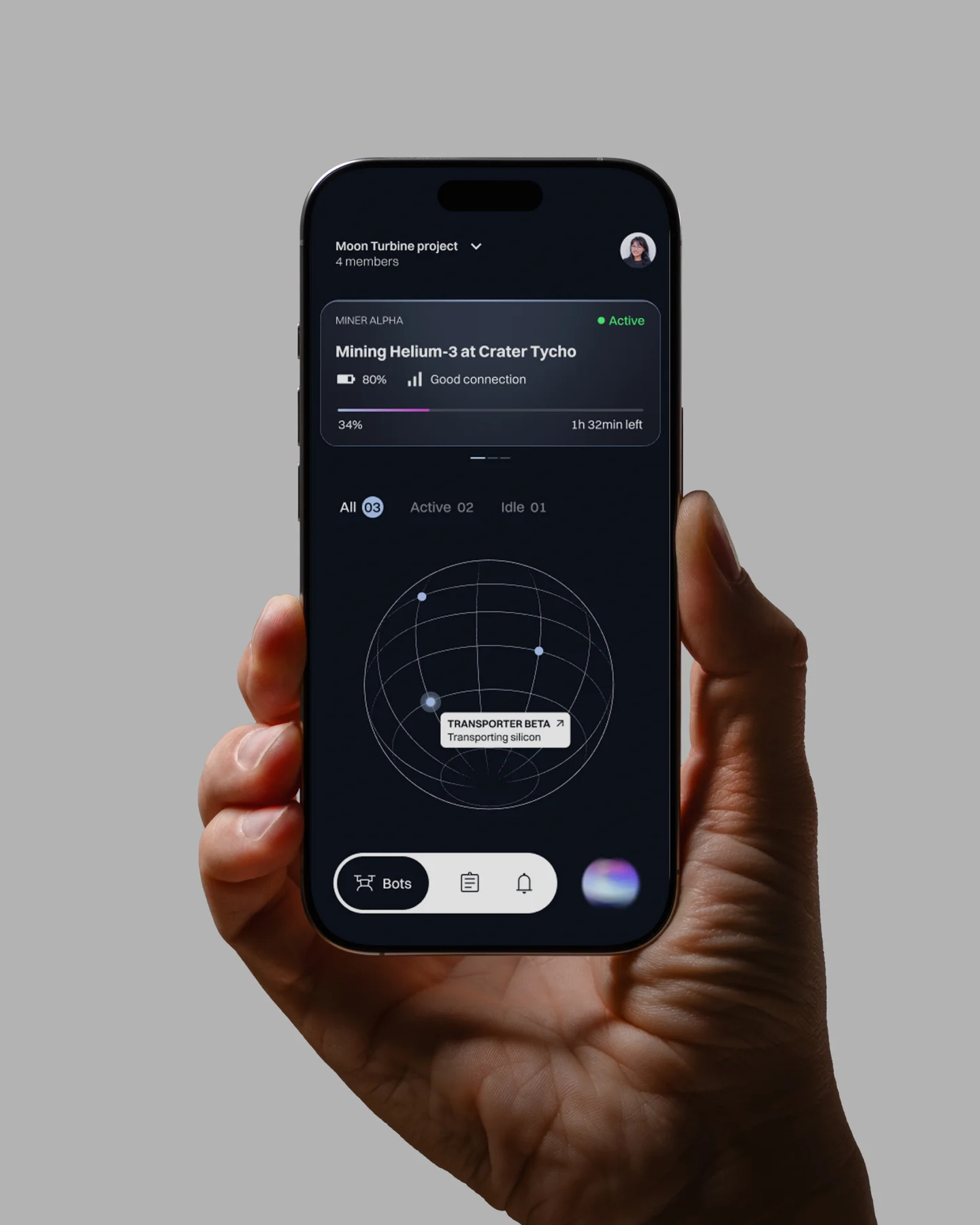
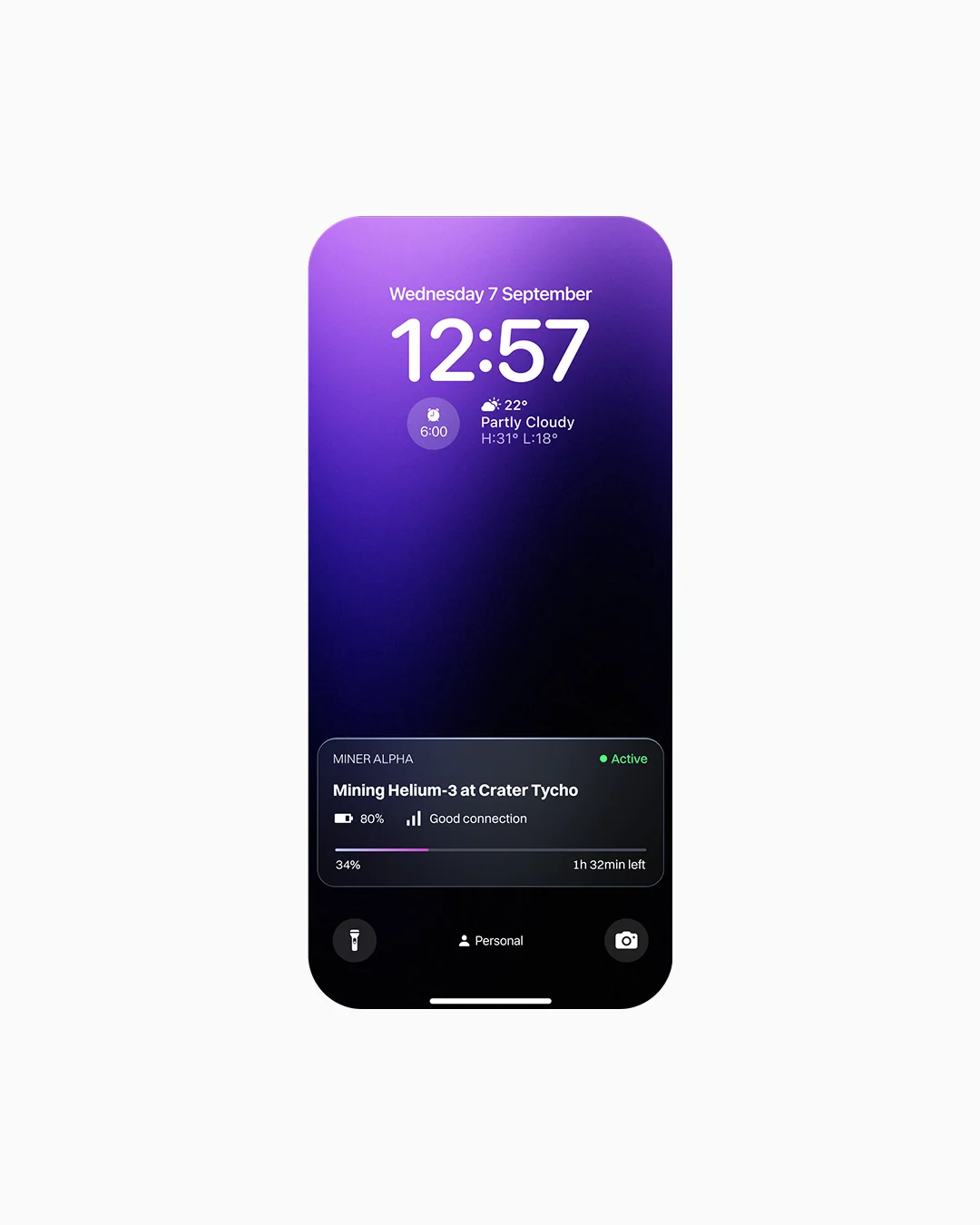
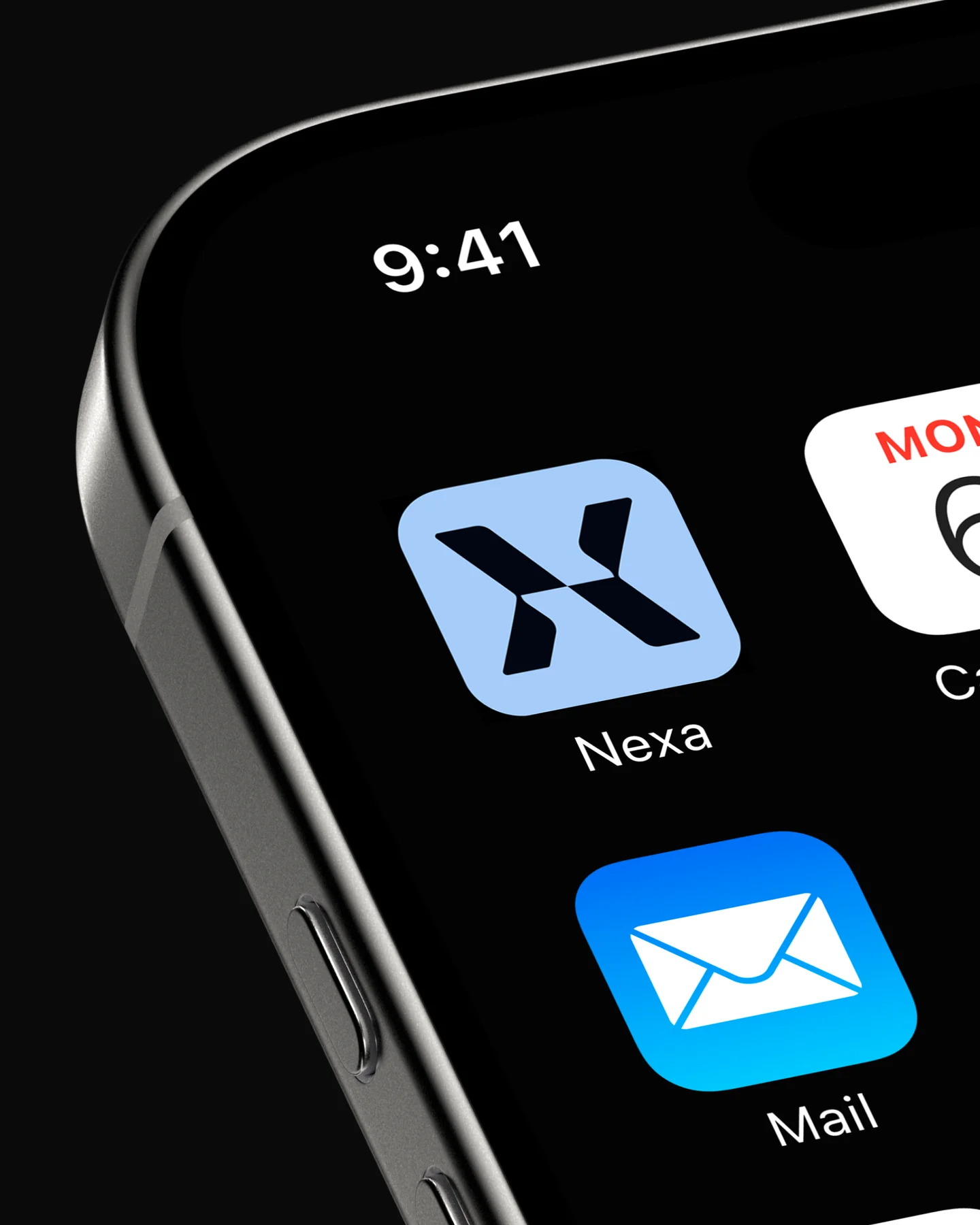
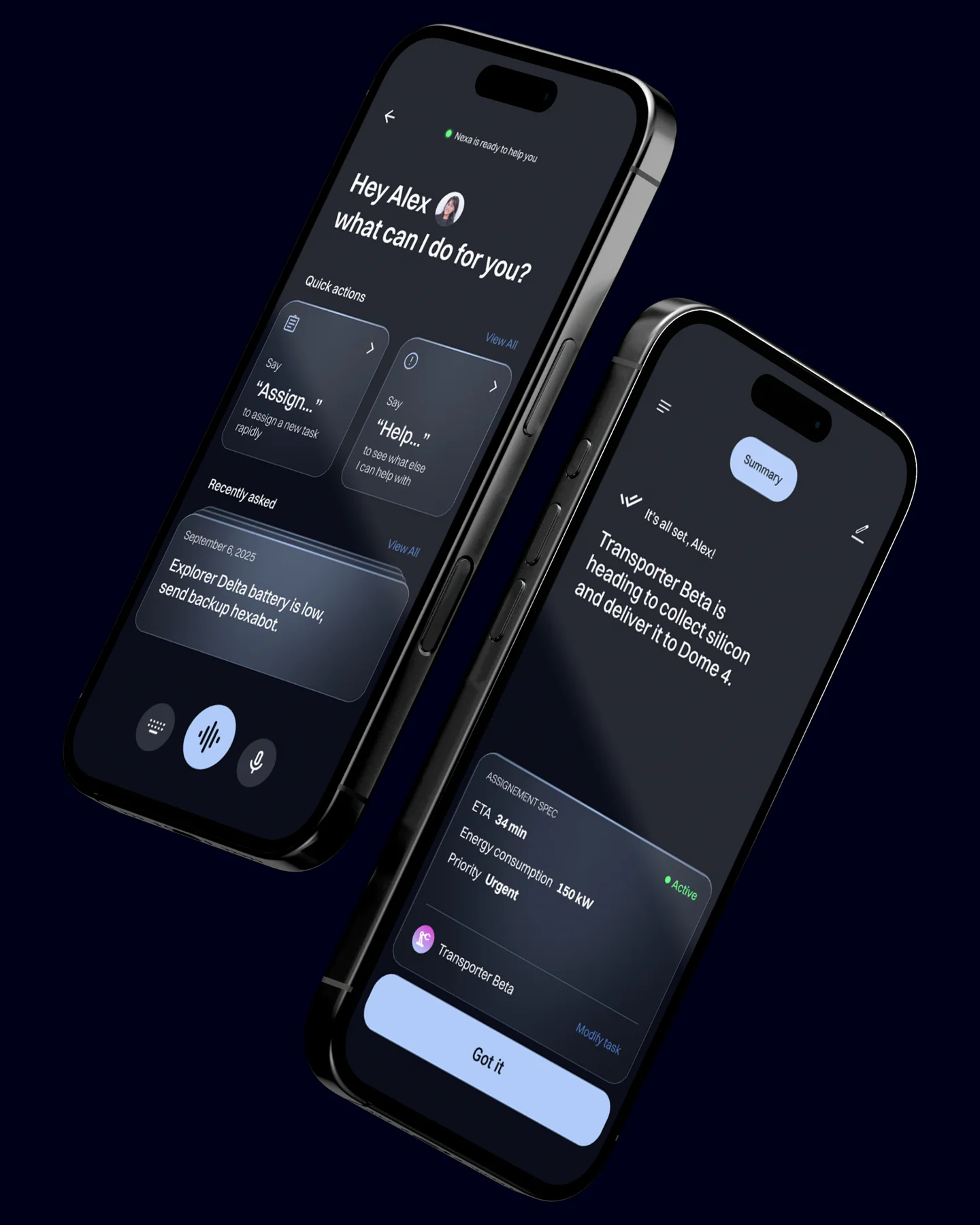
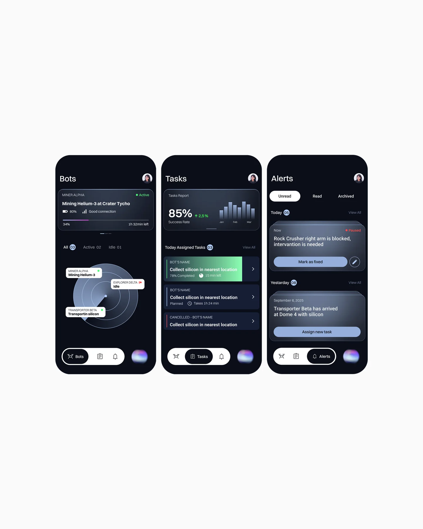
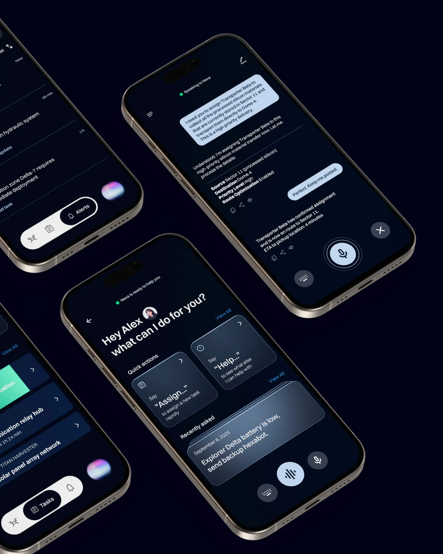
Nexa is a conceptual mobile app that imagines how we might one day manage autonomous robots on the Moon. It uses an unfamiliar setting to explore the relationship between a digital interface and machines working at a distance.
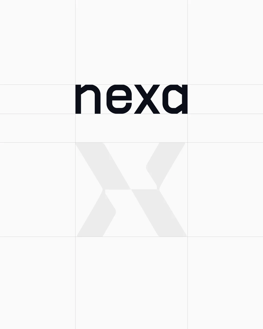
The project combines app design and brand identity. The direction considers how the interface and its visual language can belong to the same world, giving the concept a coherent expression.
- Year
- 2025
App Design, Brand Identity
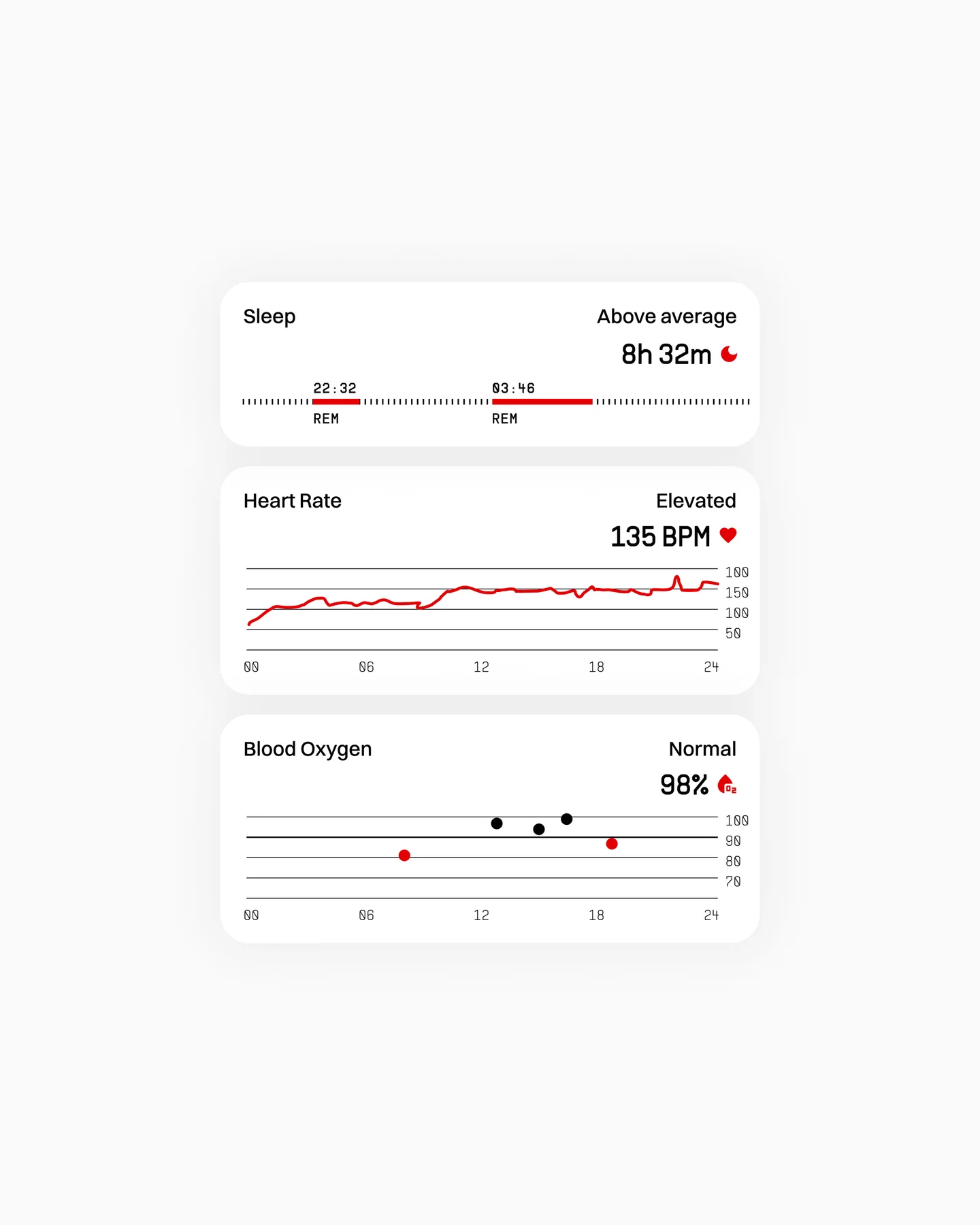
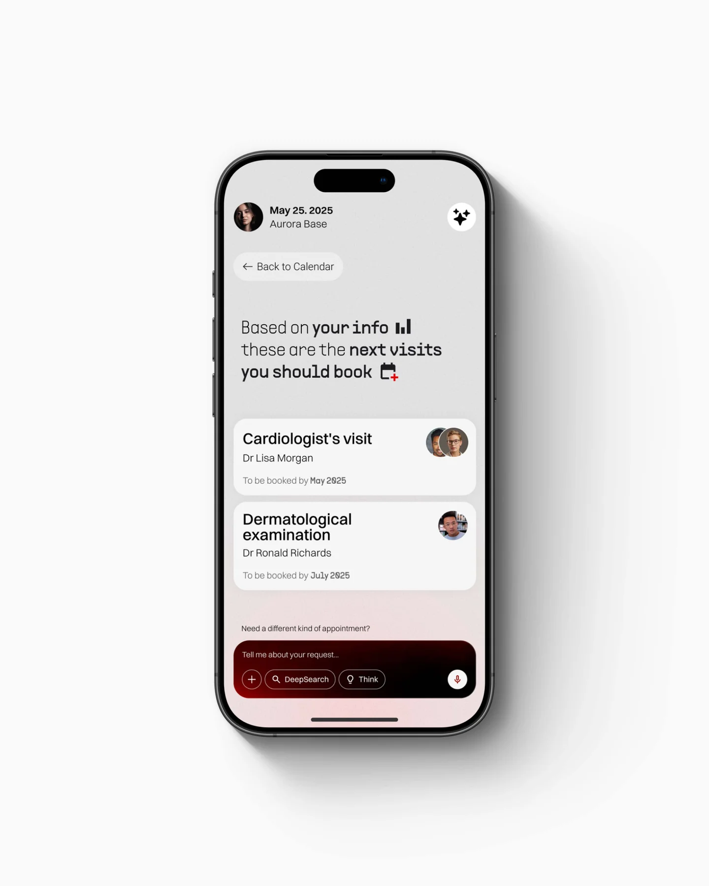
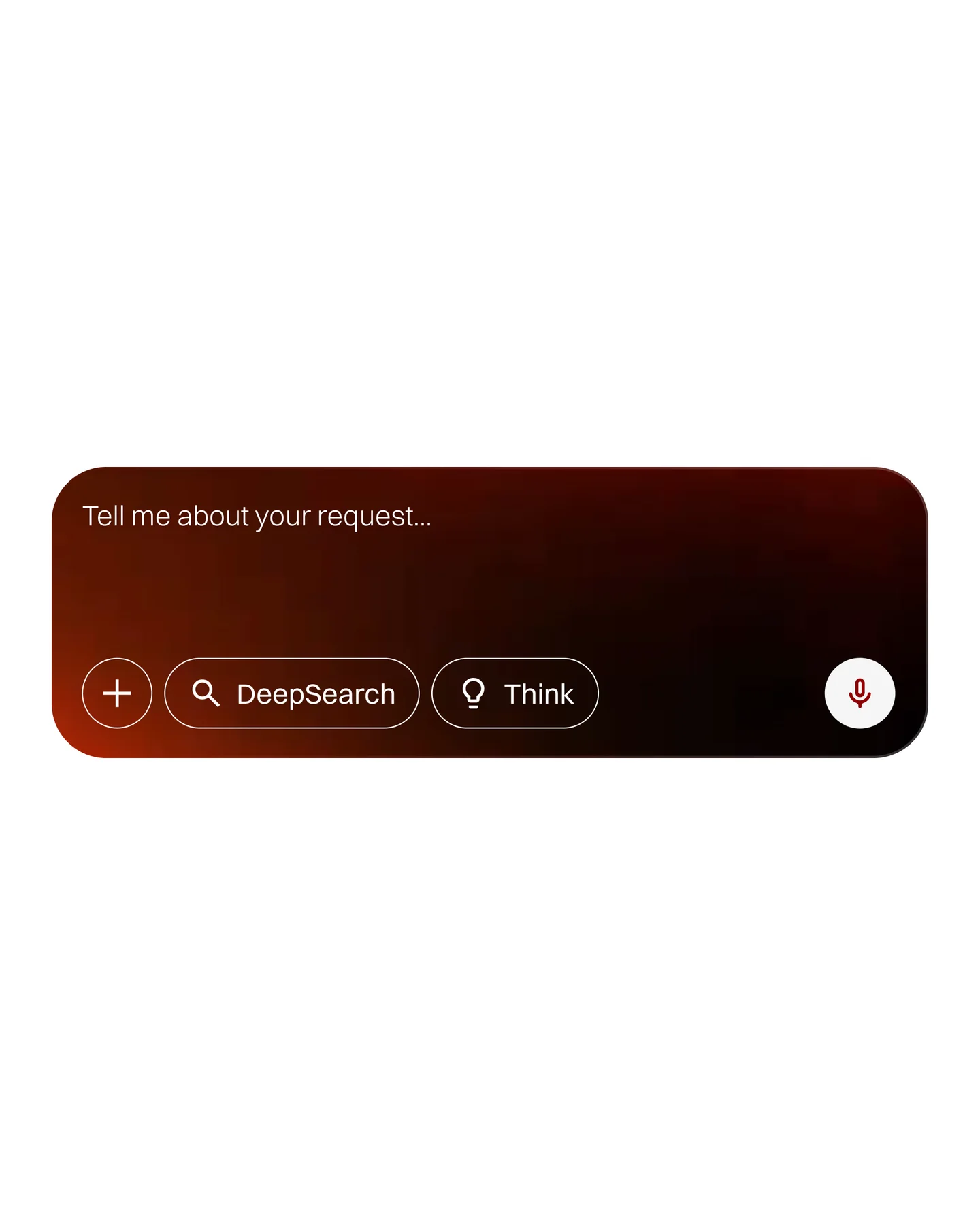
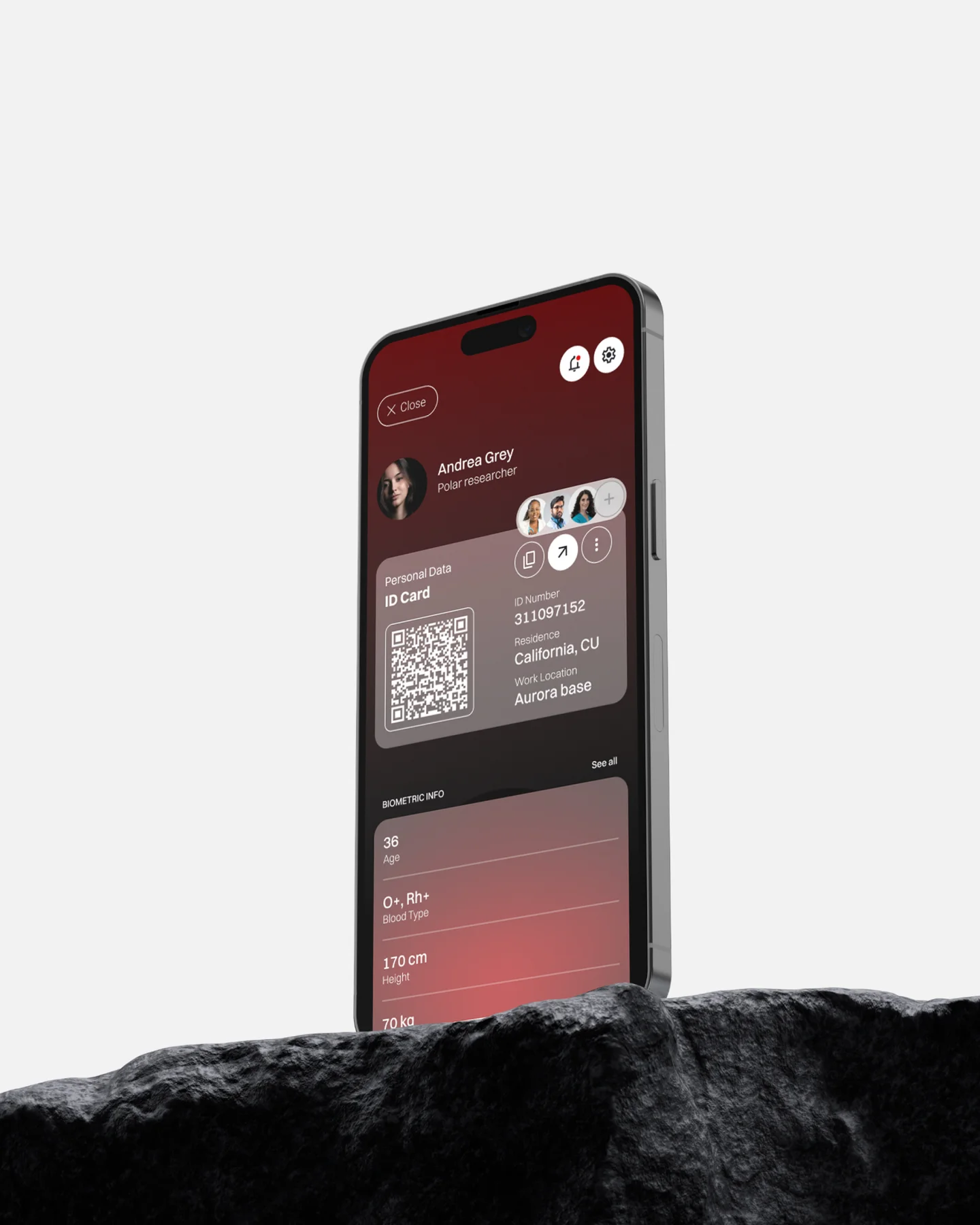
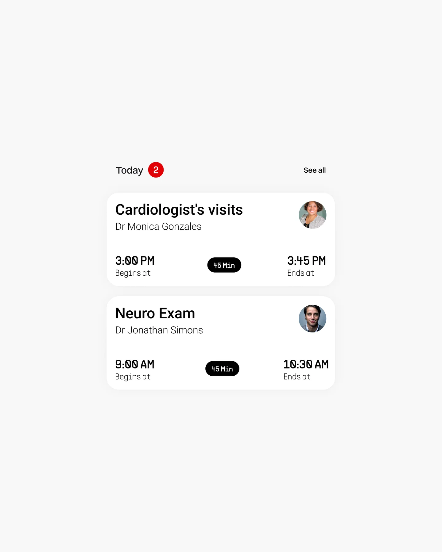
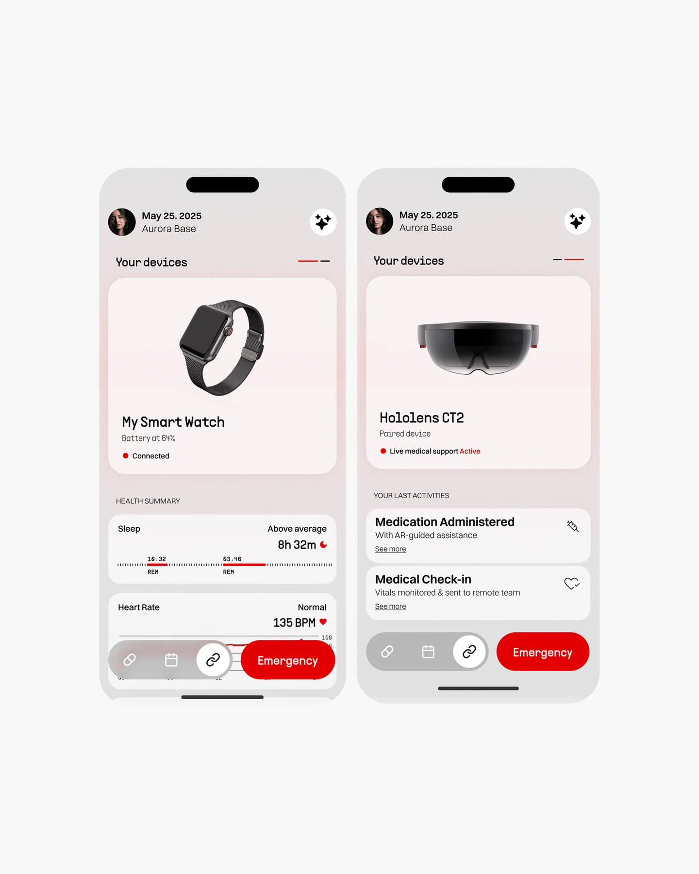
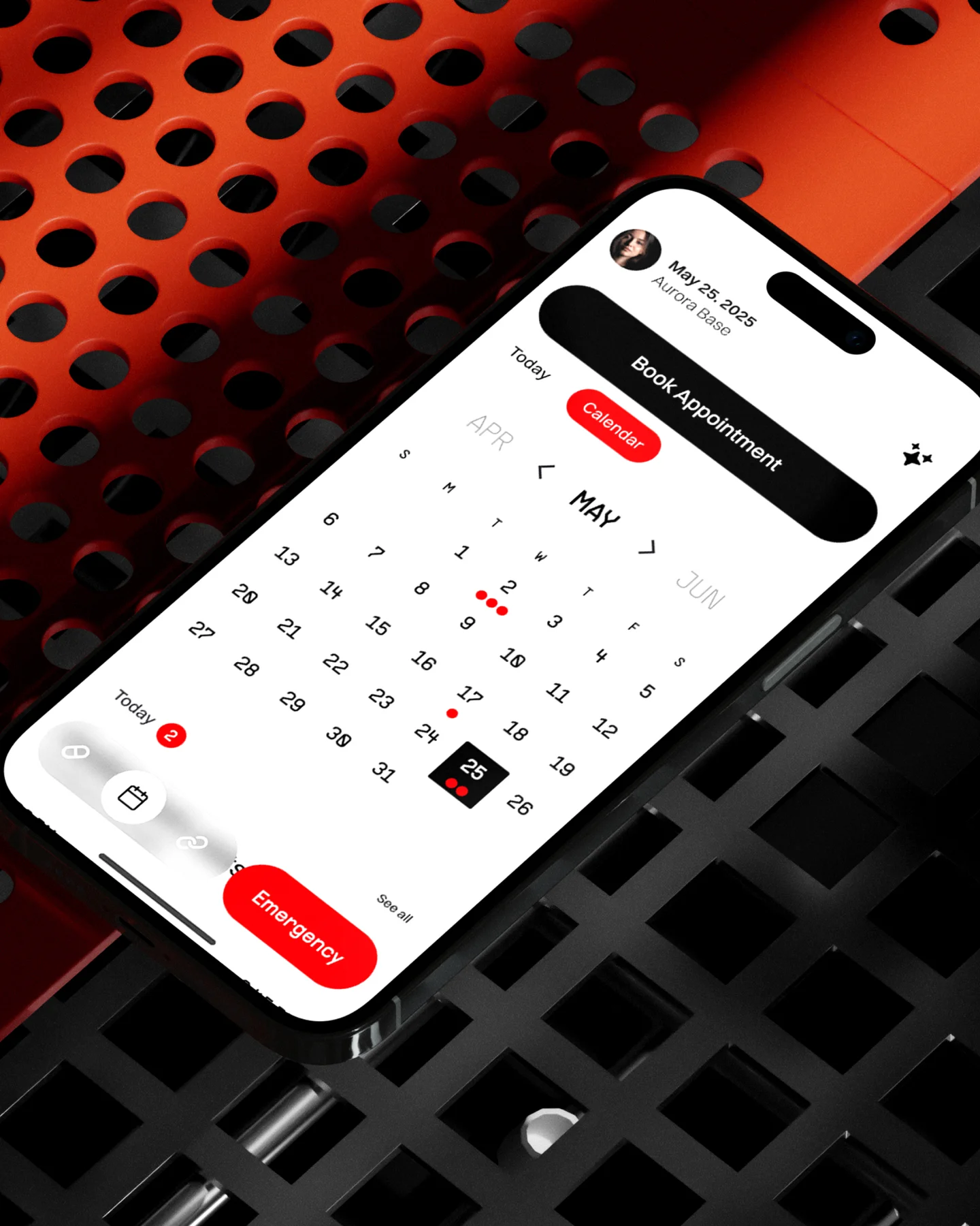
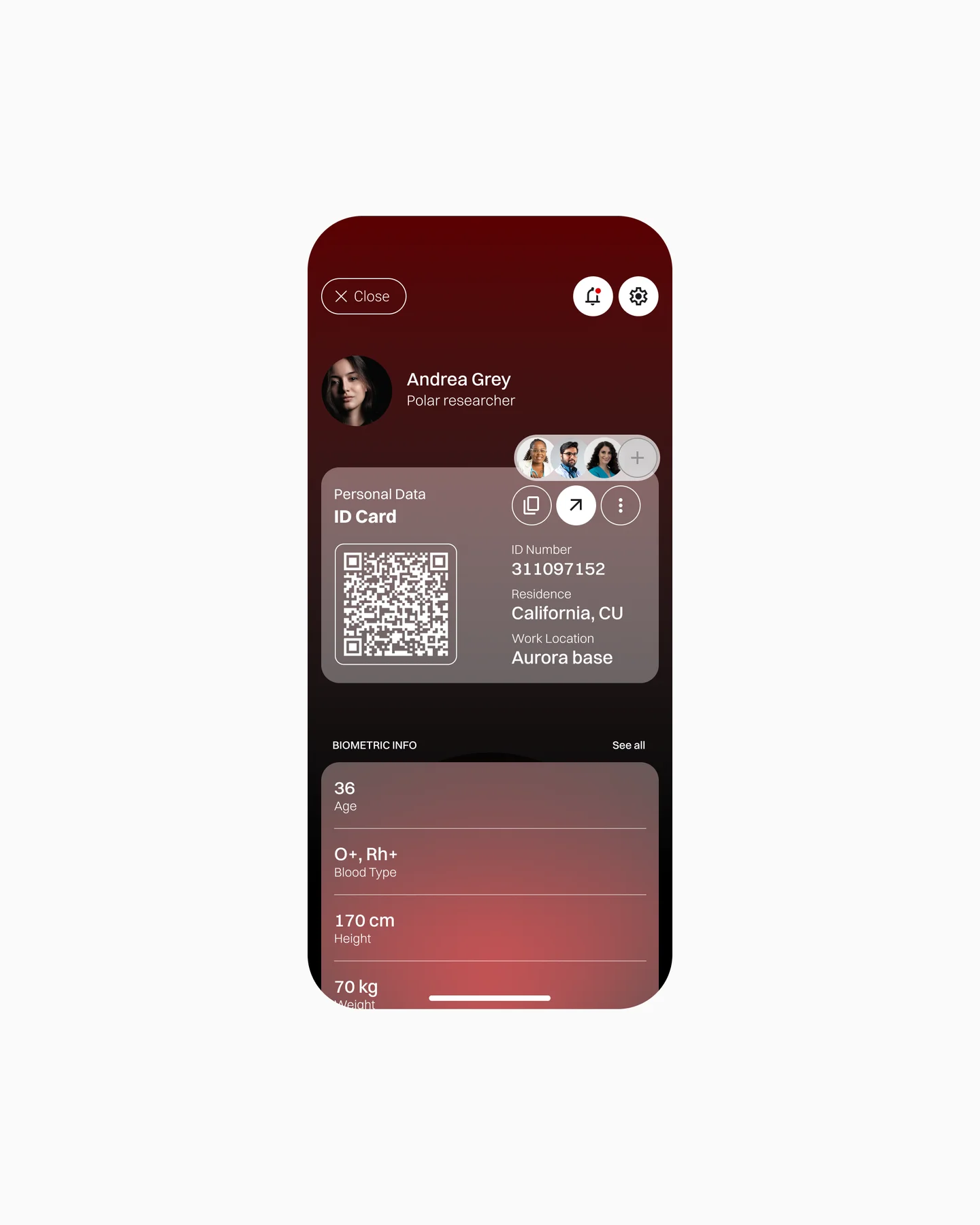
Healthtech is a conceptual mobile app for advanced health monitoring in remote locations. It focuses on scientists working away from familiar surroundings and the role a mobile experience could play in that context.
App design and brand identity are developed as parts of the same concept. The direction explores a clear visual language for a health-focused tool shaped around a specific group of people and their environment.
- Year
- 2025